If you want to improve your portrait drawing, do not start with more pressure. Start with better models. The difference between an average pencil portrait and one that feels resolved is usually not mystery. It is judgment, restraint, and the willingness to study people who already solved the hard parts.
When artists search for portrait inspiration, they usually ask the same practical questions: Which masters handled line best? Who understood value without overworking it? Which portraits still feel alive after the novelty wears off? And, most usefully, what can I borrow without copying the whole century? Ingres put the point plainly: “Drawing is the probity of art.” That is still the rule worth keeping.
For a grounded overview of the field, it helps to look at reliable reference sources such as Britannica’s profile of John Singer Sargent and the art-historical records at institutions like Tate. They show the same pattern from different angles: the best portrait artists do not rely on volume. They rely on decisions.
In this article, I’ll map ten artists whose portrait work rewards close study, then break down the techniques that matter most if you want cleaner pencil portraits of your own. You’ll also get a short reference table, a collage of public-domain portrait studies, and a few practical lessons you can apply before your next sketch. No incense. Just useful work.
Introduction to pencil portraiture
Pencil portraiture sits in an interesting middle ground. It is direct enough to feel immediate, but technical enough to punish sloppy thinking. A portrait can survive a weak background or a plain composition; it rarely survives bad proportions or confused values. That is why studying strong draftsmen still matters. They show how to simplify a face without flattening it.
The medium itself has evolved from academic drawing rooms and studio studies to contemporary hyperrealism and mixed graphite practice. The tools changed. The problem did not. The artist still has to answer the same questions: Where does the light land? Which edges should disappear? What must be described, and what can be implied?
That is the real value of studying famous pencil portrait artists: they reveal methods, not just finished images. They show how structure, proportion, and tone can do the heavy lifting. A good portrait looks effortless only because somebody paid the cost earlier.
10 artists and the techniques worth borrowing
| Artist | What to study | Why it matters |
|---|---|---|
| John Singer Sargent | Economy, edge control, and confident blocking-in | He shows how a portrait can feel complete with fewer marks than you expected |
| Jean-Auguste-Dominique Ingres | Contour discipline and anatomical clarity | He proves that a strong line can carry the whole likeness |
| Käthe Kollwitz | Tonal weight and emotional gravity | She keeps portraits serious without making them stiff |
| Egon Schiele | Angular line and psychological tension | He shows how posture changes the reading of a face |
| Pablo Picasso | Reduction and stylistic range | He makes a strong case for saying more with less |
| Paul Cadden | Layered graphite realism | He demonstrates the value of patient value-building |
| Kelvin Okafor | Surface realism and smooth transitions | He shows how to keep detail controlled instead of noisy |
| Robin Eley | Oversized graphite, fabric, and skin detail | He uses scale as a technical advantage, not a gimmick |
| DiegoKoi | Precision, patience, and refined color handling | He rewards close observation and disciplined finish work |
| Paul Lung | Meticulous graphite layering | He is a reminder that persistence is a technique too |
1. John Singer Sargent
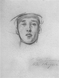
Sargent is usually filed as a painter, but his drawings deserve a place in any serious portrait study list. He was an American expatriate artist whose portrait work combined speed with control, and his graphite and charcoal studies show a rare ability to suggest personality without overexplaining every contour. If you want a reference point, start with his public record at Britannica.
What makes Sargent useful is not drama. It is economy. He could place a few marks, preserve the likeness, and leave the rest alone. That is harder than it sounds, which is why so many people avoid it by adding another layer and calling it intention. His work teaches that the most valuable detail is often the one you do not force.
Technique to borrow: build the head in major value masses first, then carve the features with edges rather than outlines. If the portrait already reads at arm’s length, you are on the right track.
2. Jean-Auguste-Dominique Ingres
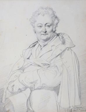
Ingres was a French neoclassical painter and one of the strongest defenders of line as the backbone of portrait art. His drawing style is exacting, but not dead. He understood that contour can carry both likeness and grace if it is disciplined enough. That is a valuable lesson for anyone who thinks portrait drawing is mostly about shading until the paper gives up.
Ingres is the artist to study when your drawings feel mushy. He keeps the silhouette clean, the anatomy ordered, and the shape relationships under control. Even when the finish is minimal, the structure feels complete. That is the difference between a sketch that looks accidental and a sketch that looks intentional.
Technique to borrow: use line to clarify proportion before chasing texture. If the outer shape is wrong, no amount of blending will save it. The paper will simply become more expensive evidence.
3. Käthe Kollwitz
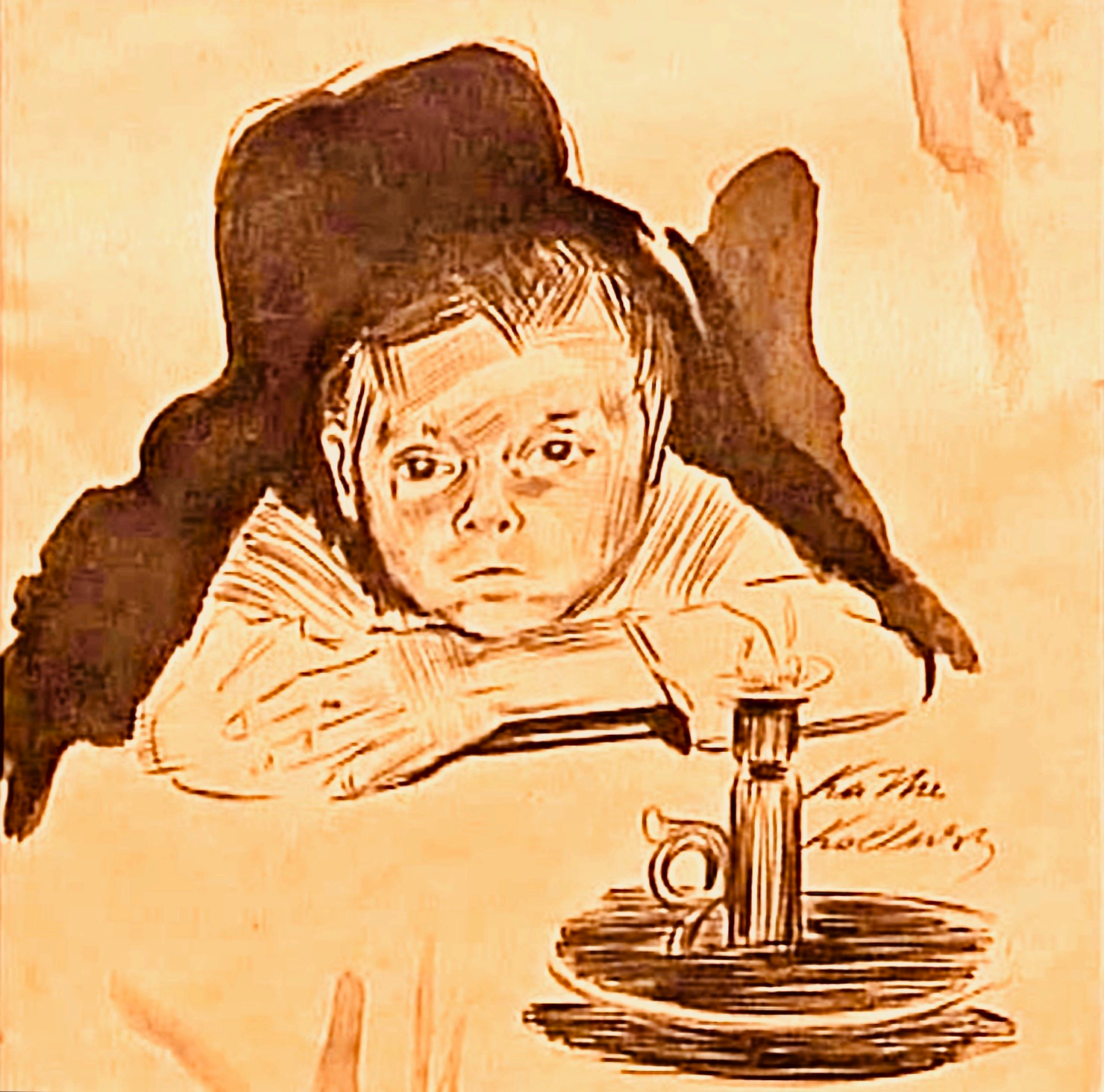
Kollwitz was a German printmaker, sculptor, and draftswoman whose portraits carry weight because she understood human faces as carriers of experience. Her work is not decorative in the modern sense. It is direct, forceful, and often spare. That is part of the appeal. She does not flatter the sitter, and she does not ask the viewer to look busy.
Her drawings are especially useful if you tend to over-detail every feature. Kollwitz shows how much power lives in tone, shadow placement, and a few sharply placed lines. The emotional result is strong, but the technical method is controlled. That combination is worth studying because it prevents sentiment from taking over the drawing.
Technique to borrow: compress your value range, preserve the darks, and let the form emerge from mass rather than ornament. A portrait can be quiet and still be unmistakable.
4. Egon Schiele
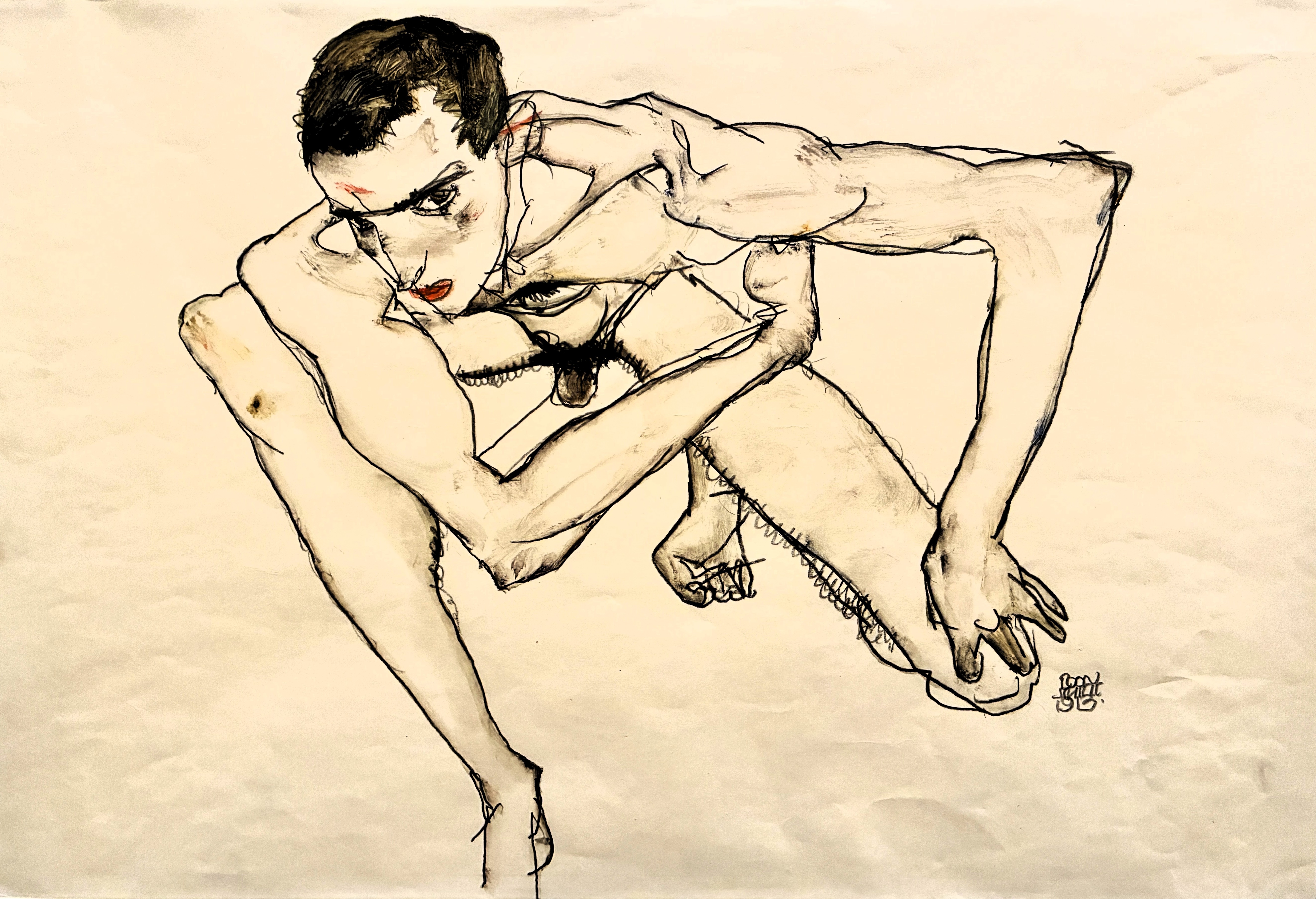
Schiele’s portraits are tense in a way that still feels modern. He was an Austrian Expressionist who used line as a structural and psychological tool, and his figures often look as though they are thinking before they speak. That matters because portraiture is not just anatomy. It is posture, relationship, and nervous system.
Schiele’s line is angular, fast, and often unforgiving. He left visible tensions in the drawing instead of sanding them away. For artists, that is a useful reminder that perfection is not always the goal. Sometimes the accurate thing is the thing with a little pressure still in it.
Technique to borrow: let contour do more work than shading. If your portrait feels emotionally flat, the answer may not be more rendering. It may be a stronger pose and a less polite line.
5. Pablo Picasso
Picasso is not the first name most people associate with pencil portraits, which is exactly why he is useful here. Across his long career, he kept returning to portrait drawing in forms that ranged from observational to highly abstract. His value is in range. He proves that a portrait can survive simplification, distortion, or almost comic shorthand and still hold a recognizable presence.
He also models something practical: style can change, but visual decision-making must remain precise. You may not want to draw a face the way Picasso did in every decade of his life, but you should study how quickly he gets to the point. The man could suggest a jawline with fewer lines than most people use to order coffee.
Technique to borrow: practice portrait sketches that reduce detail by half while keeping likeness. If the face still works, you are seeing the structure, not just the surface.
6. Paul Cadden
Cadden is a contemporary Scottish artist known for hyperreal graphite drawing. His portraits and figures push pencil into territory that looks almost photographic, but the real lesson is not “make it look like a camera.” The lesson is patience: many thin decisions, layered over time, until the surface becomes convincing.
What separates artists like Cadden from ordinary renderers is value control. He understands that smooth realism depends on tiny shifts, not heroic jumps. The work looks calm because the process was not. That is usually how it goes. Great finishes are rarely produced by relaxing.
Technique to borrow: work in passes. Build the portrait from broad tonal statements to smaller transitions, and do not touch the final highlights until the whole structure is correct.
7. Kelvin Okafor
Kelvin Okafor is one of the most visible contemporary graphite portrait artists, and his work has become a reference point for artists who want realism without deadness. His portraits focus on skin texture, hair, and minute tonal shifts, but they avoid the common trap of turning every surface into visual static. The result is detailed, but still breathable.
That balance matters. A hyperreal portrait should not feel like a technical diagram of pores. Okafor’s work shows how to keep the face luminous and structured at the same time. For anyone working from photos, that is an important distinction. Copying a photo is easy; making it feel like a portrait is the part that earns the bill.
Technique to borrow: save your darkest accents for the final read and keep the midtones smooth. Once the values are clean, the likeness will do more of the work for you.
8. Robin Eley
Robin Eley is known for large-scale graphite portraits that often include fabric, skin, and tightly controlled detail. Scale is part of his method. At a larger size, the viewer sees the drawing as an object as well as an image, which changes how the portrait behaves. It becomes less like a snapshot and more like an encounter.
Eley’s work is also useful because it treats texture as a hierarchy. Not every surface gets the same attention. That is a lesson many artists need to learn more than once. If everything is equally rendered, nothing is truly important. The eye gets tired and the portrait starts to sound like a meeting with no agenda.
Technique to borrow: choose one or two passages for extreme detail and keep the rest disciplined. Contrast in finish is as important as contrast in value.
9. DiegoKoi
DiegoKoi is an Italian artist recognized for highly detailed portrait and figure drawings, often in colored pencil and graphite. His work is especially useful if you want to understand how patience, restraint, and accurate color layering can create a convincing skin tone without drifting into plastic-looking surfaces. He makes meticulous work feel controlled rather than obsessive.
Artists studying portrait realism can learn a lot from his balance of sharpness and softness. Edges are managed carefully. Small transitions matter. And the drawing never forgets that a face is an arrangement of forms, not a contest to see how many eyelashes can be documented before lunch.
Technique to borrow: render one area fully, then compare it to the neighboring planes before moving on. This keeps the portrait coherent instead of fragmented.
10. Paul Lung
Paul Lung, based in Hong Kong, became well known for intricate graphite portraits that demonstrate just how far patience can be pushed in pencil work. His drawings are not valuable because they are laborious. They are valuable because the labor is organized. Every layer contributes to a single clear finish.
That makes Lung a useful corrective to the idea that better portrait drawing is mostly about talent. Talent helps. Structure helps more. Lung’s work reminds us that long-form pencil portraits depend on method, time, and a willingness to keep adjusting the same image until the values tell the truth.
Technique to borrow: keep a consistent drawing rhythm. Sudden impatience is how details drift. A clean portrait is usually the result of a stable process, not a dramatic rescue.
How to turn these artists into better drawings
The point of a reference list is not to collect names. It is to choose habits. If I were turning this into a workable practice plan, I would borrow three things from the artists above:
- From Sargent and Ingres: start with structure and line economy.
- From Kollwitz and Schiele: use tone and contour to shape mood, not just likeness.
- From Cadden, Okafor, Eley, DiegoKoi, and Lung: build detail in layers and decide where finish actually matters.
That is a practical sequence. It keeps you from finishing the eyelashes before you have finished the head. A portrait drawing should not resemble a room where the furniture arrived before the walls.
If you want a simple study routine, try this: choose one artist for line, one for tone, and one for realism. Copy a small section of each. Compare what changes in your own work. Then draw the same subject again, but with one rule removed. The goal is not imitation. The goal is judgment.
Conclusion and where to find more
Ten artists are enough to reveal the pattern. The best pencil portrait work is usually built on three things: clean structure, controlled values, and restraint about detail. The names change. The discipline does not.
If you want to keep studying, start with museum and reference pages rather than internet noise. The Britannica entry on Ingres, the Tate record for Käthe Kollwitz, and the broader artist pages at institutions such as the Museum of Modern Art are all better starting points than random image searches with heroic confidence.
For this site’s own portrait work, the most useful next stops are the Home page and the About page. They give the practical context behind the portrait service, the kind of context that matters when you are deciding what to commission, what to save, and what to ignore. For studios that also need to decide where automation fits into intake, reference tracking, or client communication, a neutral planning resource like AI consulting services can help frame the questions before anyone starts building.
Key takeaways
- Strong pencil portraits are built on structure before decoration.
- Different artists teach different priorities: line, tone, restraint, texture, and finish.
- Contemporary graphite artists are worth studying alongside historical masters.
- Practice works best when you borrow one specific technique at a time.