If your portrait falls apart, the first thing to blame is usually not talent. It is usually the boring stuff: a bad photo, vague proportions, cheap paper, or pencil pressure that bulldozes the surface before the drawing has a chance to breathe. That is the actual problem. Everything else is theater.
If you want to draw a pencil portrait from a photo, you need a process that survives contact with reality. That means deciding what the reference can support, mapping the face before chasing detail, and shading in layers instead of trying to win the whole drawing in one dramatic afternoon. For a wider definition of portraiture, the Tate portrait guide is a clean place to start; for paper choice, Strathmore’s graphite and paper notes are practical instead of mystical; and for feature placement, Artists Network’s beginner facial-feature guide gives a useful baseline.
This guide walks through the actual workflow: what to gather, how to choose a usable photo, how to sketch the outline, how to add shading without turning the paper into soup, and how to finish the piece so it can be framed without apology. If you want to keep reading more site material after this, the home page gives the main site context and the blog index collects the rest of the tutorials.
Before the steps start, here is the blunt version of the job: you cannot shade your way out of bad structure. Most beginners try anyway. It wastes time and produces the same tired face with better shadows. Rule that out first.
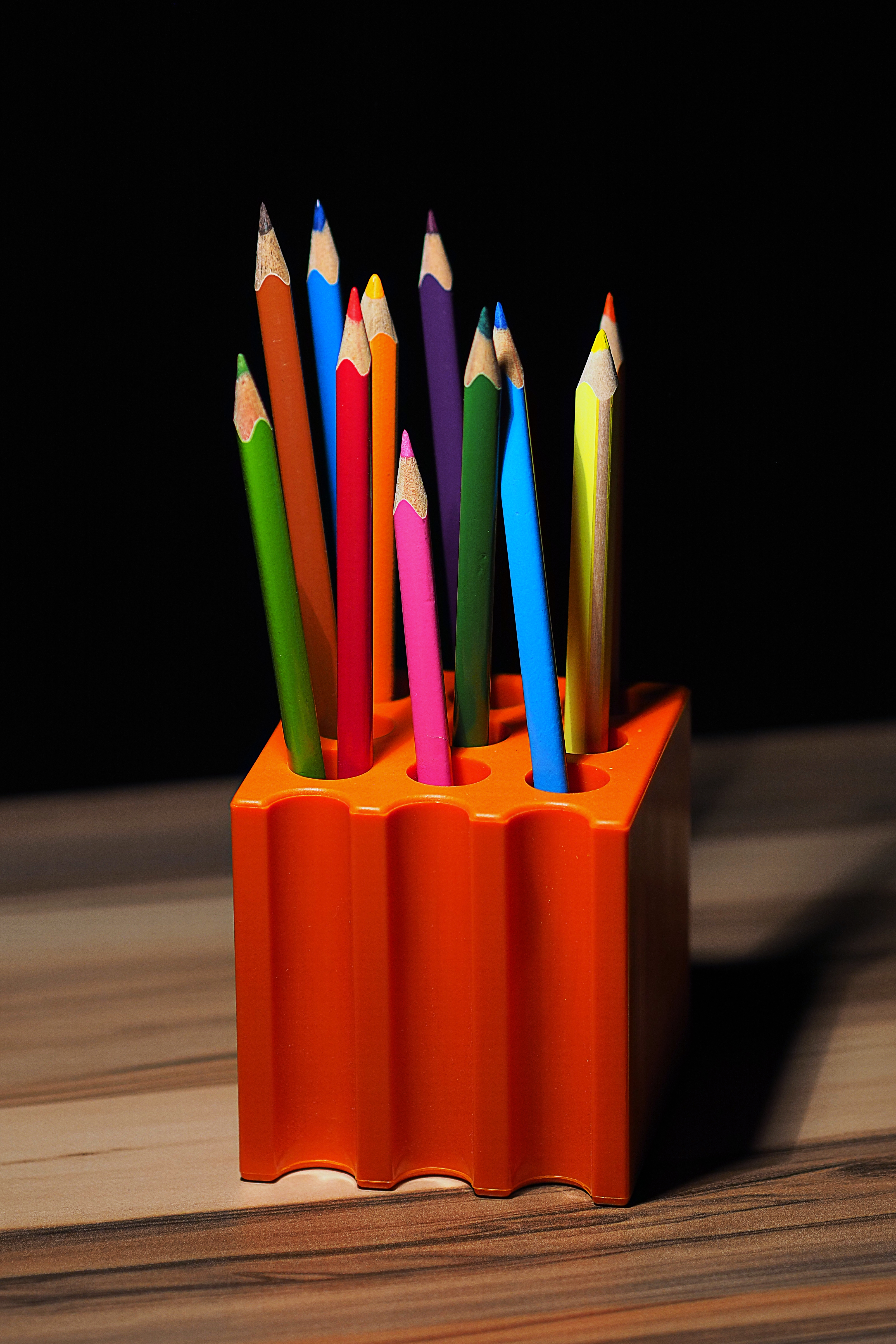
1. Gather your materials
Do not overcomplicate this stage. A pencil portrait from a photo does not need a suitcase full of gear. It needs a short list of tools that are predictable, controllable, and easy to replace. If the kit is chaotic, the drawing process becomes chaotic too. That is not philosophy; it is just friction.
| Material | What it does | What to choose first |
|---|---|---|
| Graphite pencils | Provide the lines and values that build the portrait. | HB, 2B, 4B, and 6B cover most beginner needs. |
| Drawing paper | Gives the surface that either supports or ruins the work. | A smooth or medium-smooth portrait paper. |
| Kneaded eraser | Lifts graphite gently and shapes highlights. | Use it for light corrections and soft cleanup. |
| Vinyl eraser | Removes stronger marks when you need an actual correction. | Keep one nearby, but do not scrub the paper. |
| Sharpener | Maintains a point for edges, lashes, and small features. | A clean manual sharpener is enough. |
| Blending stump or tissue | Softens larger value changes. | Use lightly; overblending is how detail disappears. |
| Reference photo | Sets the structure, lighting, and expression. | Choose a sharp image with useful light and shadows. |
That is enough to start. If you want color later, fine. But the beginner mistake is buying a giant set and assuming the box will solve the drawing. It will not. The drawing improves when the artist can see value, edge, and proportion clearly, not when the desk looks expensive.
One practical note about paper: if the paper surface is too rough, the pencil will catch in all the wrong places. If it is too slick, layers can slide around or fail to build. The middle ground is usually the least glamorous and the most useful. That tends to be true in art and in life, which is annoying but efficient.
What to check before you begin
- Can you sharpen the pencil to a clean point without breaking the lead?
- Does the paper accept a light line without tearing up the surface?
- Do you have an eraser that lifts rather than destroys?
- Can you place the reference photo where you can compare it without squinting?
If any answer is no, fix that before you start the portrait. A bad setup leaks problems into every later step.
2. Choose your photo
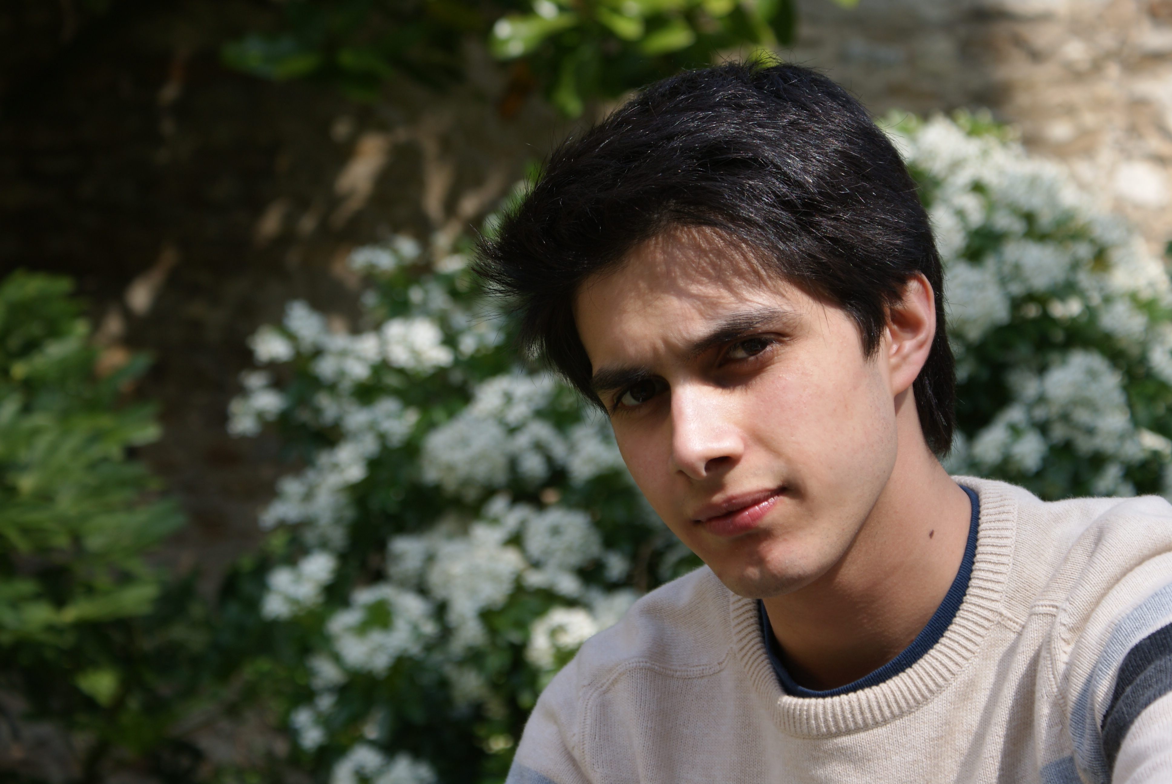
This is where many portraits fail before they are even drawn. A photo can look fine on a phone and still be awful as drawing reference. The reason is simple: a good portrait reference needs shape, not just sentiment. The face must be readable in light and dark, and the features need enough separation that the artist can measure them.
The right reference photo should give you three things: clear edges, visible shadows, and enough detail to understand the structure of the face. The wrong photo gives you motion blur, harsh glare, flattened lighting, or a weird angle that hides the actual anatomy. You can draw from bad photos if you enjoy making life harder for no reward. Most people eventually stop doing that.
Use this checklist for photo selection
- Sharp focus: The eyes, nose, and mouth must be readable.
- Good lighting: Look for one clear light source that creates useful shadows.
- Natural expression: Choose a face that still looks like the person, not a passport mug shot with bad chemistry.
- Useful angle: Straight-on or slight three-quarter views are easier for beginners than extreme side angles.
- Enough contrast: You need darks and lights to show the form.
- No major blur: Motion blur makes edges ambiguous and kills the reference value.
A lot of people think they need the “perfect” photo. They do not. They need a usable one. Usable means the structure is clear enough for the drawing to hold together. If the light is dull, fix the light in the photo selection stage by choosing a better image. Do not expect pencil to rescue what the camera already failed to record.
For proportions and feature placement, it helps to look at a practical facial-feature guide rather than trusting intuition alone. The Artists Network facial-feature guide is useful because it keeps the problem grounded: placement first, polish second. That order matters.
What not to choose
| Bad photo type | Why it causes trouble | What to do instead |
|---|---|---|
| Motion blur | Edges are smeared and the face becomes vague. | Use a sharper image with a stable pose. |
| Harsh flash | It destroys the natural shadow structure. | Choose soft daylight or directional indoor light. |
| Heavy filters | They distort skin tones and values. | Use the original image if possible. |
| Extreme crop | Important proportions may be cut off. | Keep enough of the head visible to measure the whole shape. |
If you are drawing a portrait for a gift, a good source photo matters even more. People want likeness, not a clever interpretation of a blurry mistake. If you want to see how the site frames that side of the work, the Pencil Portrait Gifts page and the Portrait Gift Details and Information page explain the commission side of the process.
3. Sketching the outline
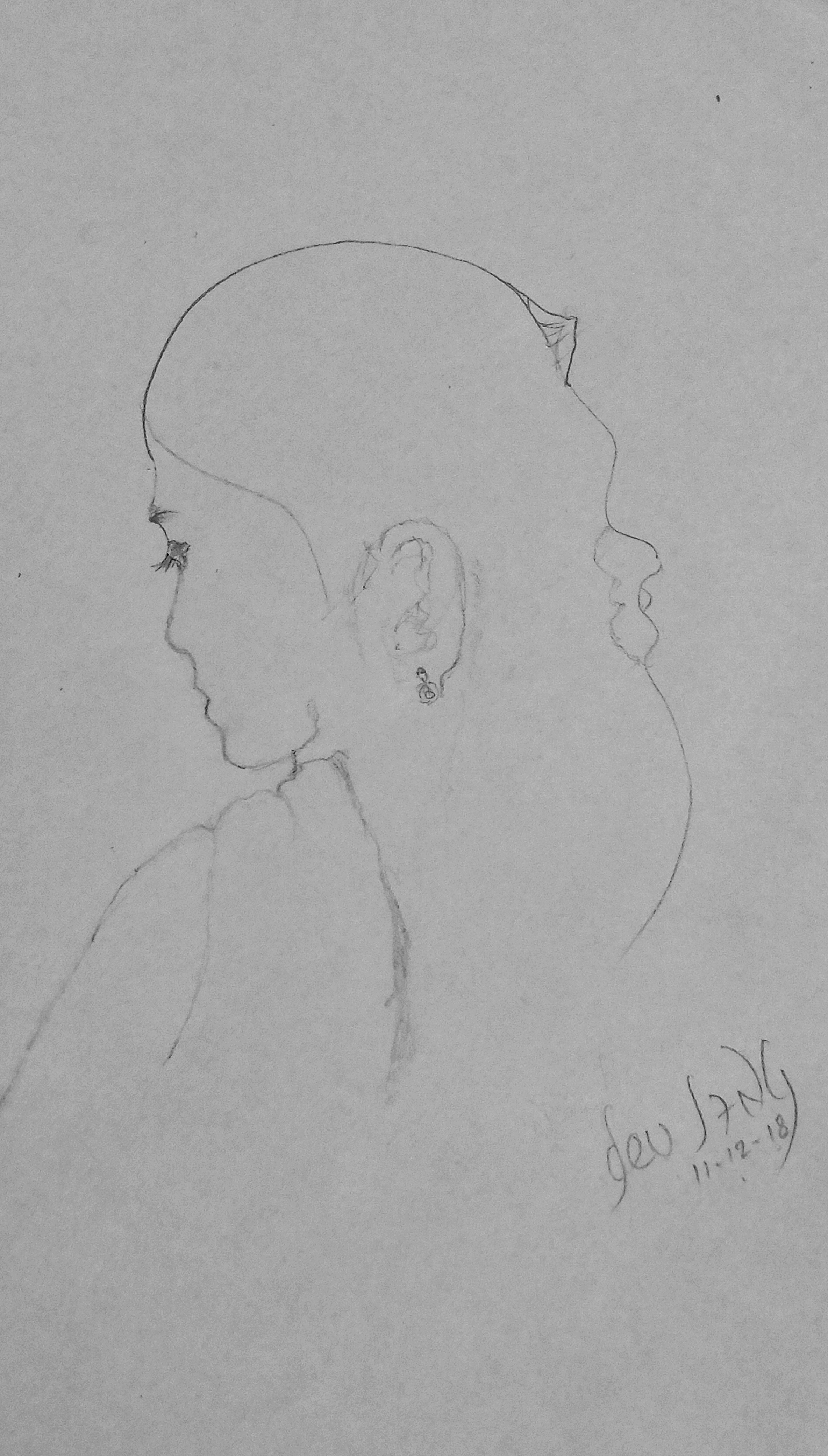
This is the stage where beginners get greedy. They start chasing eyelashes, eyebrows, pores, and “character” before the face is even sitting in the right place. That is backwards. The outline exists to solve proportion and placement. If the outline is wrong, every detail becomes an expensive decoration on a broken structure.
Start with very light marks. Think layout, not performance. Draw the head shape first, then place the centerline, eye line, nose line, mouth line, and the general mass of the hair. Keep the lines loose enough to adjust. The goal is to place the major landmarks so the portrait can be checked against the photo early.
A simple outline method
- Block in the biggest shape of the head.
- Mark the tilt of the head and the centerline.
- Place the eyes as shapes, not as finished eyes.
- Measure the nose and mouth spacing against the eyes.
- Indicate the ears, jaw, and hairline with light structure.
- Step back and compare the layout before touching shading.
Do not press hard. I am repeating that because beginners ignore it at least once. Hard lines are difficult to correct and harder to integrate into the later shading. Light lines give you room to move. Portrait drawing rewards the person who leaves room for corrections, not the person who tries to be brave with graphite.
If you are unsure about placement, use a grid. The grid method is not glamorous, but neither is a portrait with one eye two millimeters too high. The grid lets you compare shapes in smaller pieces and reduces the chance that one bad guess infects the whole face. It is a crutch, yes. So is a ladder. Use the ladder.
What to look for while sketching
- Does the eye spacing match the reference?
- Is the nose centered where it should be?
- Do the mouth corners line up with the structure around them?
- Is the jaw angle believable?
- Does the head tilt match the reference photo?
At this stage, the sketch should look thin and unfinished. That is fine. A timid outline is better than a confident lie. The drawing will gain weight later when the values are in place. Structure first. Drama later.
4. Adding details and shading
Now the portrait starts to become useful. Shading is where the drawing gains depth, but shading is also where beginners waste the most time by attacking every area equally. That is not shading. That is smearing. Real shading describes form. It tells the viewer which parts turn toward light and which parts fall away from it.
Start with the largest shadow masses. Do not begin with eyelashes or hair strands. Block in the eye sockets, under-nose area, lower lip shadow, jaw shadow, and the values that define the cheeks. Build in layers. Soft layers first, darker layers later. If you go too dark too soon, you lock the drawing into mistakes before the structure has a chance to prove itself.
For a straightforward discussion of tone and value, the Tate tone guide is useful because it keeps the idea clean: light and dark create depth. That is all the jargon most beginners need. If the tones are flat, the portrait looks flat. If the tones turn with the form, the face starts to feel real.
Layer shading the boring way, which is the correct way
- Use the pencil lightly at first.
- Increase darkness in small passes, not one violent stroke.
- Keep checking the value against the reference photo.
- Reserve the darkest darks for the end.
- Leave some highlights untouched so the face can breathe.
That method sounds slow because it is slow. Portraits are built, not rushed. If you want speed, choose a different hobby. Here, restraint is the tool that saves the likeness.
Blending tools should be used sparingly. A blending stump can soften a cheek or a forehead, but too much blending kills texture and makes the drawing muddy. Use it when you want a transition, not because you are bored. Bored blending is how paper becomes regret.
Where to place detail first
- Eyes and the skin around them.
- Nose structure and nostril shadows.
- Mouth edges and the shadow beneath the lower lip.
- Hair masses, not individual strands.
- Background tone only if it supports the face.
Hair deserves a warning. Beginners love hair because it looks like progress. It is also the easiest place to hide bad structure. Do not build the portrait out of hair. Build the head first, then use hair to support the shape. Draw the masses, not the fairy tale of every strand. Nobody needs that kind of self-deception.
Edges matter just as much as shadow. A hard edge around the eye or the nostril can focus attention. A softer edge on the cheek or jaw can move the eye through the portrait without stopping. If every edge is hard, the portrait looks cut out. If every edge is soft, the portrait looks foggy. Neither is flattering.
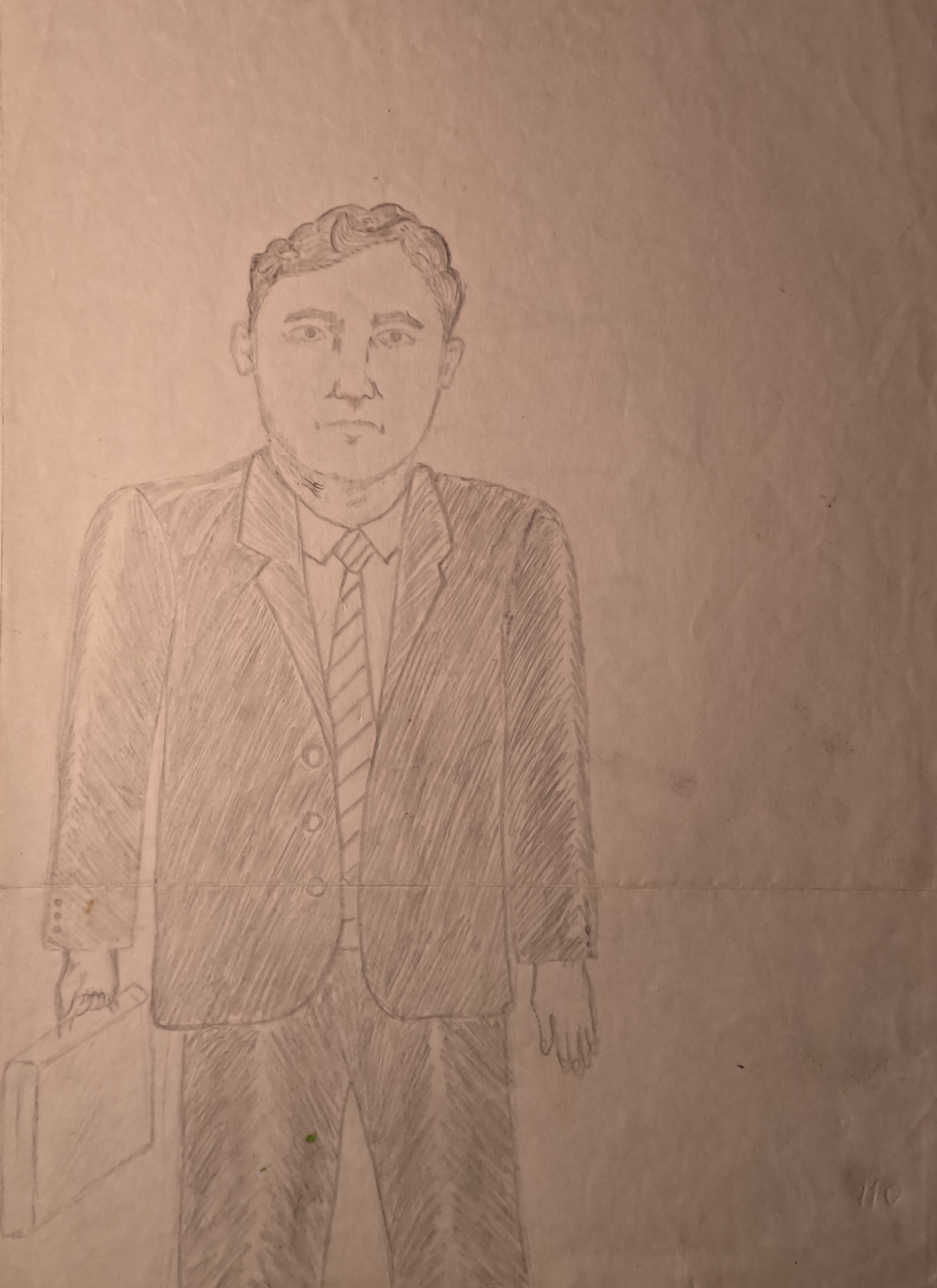
Signs the shading is working
- The face starts to look round instead of flat.
- The eyes sit naturally inside the skull, not pasted on top of it.
- The nose has a structure, not just an outline.
- The mouth feels connected to the chin and cheeks.
- The darkest marks are controlled, not scattered everywhere.
If those signs are missing, do not pile on more detail. Go back to the large shadow shapes. Most broken portraits do not need more rendering; they need better organization.
5. Final touches and framing
Final touches are not a license to keep fiddling forever. They are the last chance to correct the obvious mistakes and reinforce the important areas. This is where you clean the edges, adjust the contrast, and remove anything that still feels accidental. The purpose is not perfection. The purpose is control.
First, compare the portrait to the reference one more time. Look at the spacing of the eyes, the width of the mouth, the angle of the jaw, and the overall balance of light and dark. If something still feels off, fix the structure before polishing the surface. A polished error is still an error. It just looks more expensive.
Final cleanup checklist
- Erase stray construction lines that are still visible.
- Deepen only the shadows that truly need stronger contrast.
- Lift highlights on the forehead, nose bridge, cheek, or eye catchlights if needed.
- Check the background so it does not fight the face.
- Sign the artwork only after the portrait feels settled.
Framing matters if the portrait is meant to be given away or displayed. A clean mat and frame can make a pencil portrait look finished rather than accidental. Choose framing that protects the paper and keeps the drawing from touching glass if the medium needs space. If you are making the piece as a gift, this part is not optional. Presentation is part of the object. Pretending otherwise is how good drawings get treated like homework.
If the portrait is a commission, make a final pass over the likeness before you hand it off. Ask whether the subject would recognize the face immediately and whether the values support the expression. A portrait should not require a paragraph of explanation. It should already know what it is.
Common mistakes and the fix for each one
| Mistake | What it looks like | Correction |
|---|---|---|
| Going too dark too early | The face looks trapped under heavy graphite. | Back up, lighten the pressure, and rebuild value in layers. |
| Chasing details too soon | The eyes are finished while the head still drifts. | Return to the head shape and the facial landmarks. |
| Using a poor reference photo | Blur, glare, or odd lighting makes the face hard to read. | Choose a sharper, better-lit photo before drawing anything serious. |
| Overblending | The portrait loses texture and turns muddy. | Use blending only where a soft transition helps the form. |
| Ignoring the shape of shadows | The face looks flat or artificially outlined. | Shade the shadow masses as shapes, not random dark patches. |
Those five mistakes account for most beginner frustration. Notice that none of the fixes involve “being more creative.” They involve measurement, patience, and better decisions. The medium is not mysterious. The artist just keeps trying to cheat it.
How to keep improving
You improve faster when you draw small studies on purpose. Draw just the eyes. Draw just the nose. Draw one mouth from three different photos. Then draw a full head. That sequence teaches you where structure comes from and where the lie begins. The lie is usually the moment you stop measuring and start hoping.
A simple practice routine can look like this:
- Session 1: Five quick head outlines from reference photos.
- Session 2: Shadow-shape studies using only two pencils.
- Session 3: One eye study focused on edge control.
- Session 4: One nose and mouth study focused on value layering.
- Session 5: One full portrait with a limited time cap.
That routine works because it forces repetition without turning every drawing into a high-stakes event. Most artists do not fail because they lack genius. They fail because they keep choosing projects too large to teach them anything before frustration takes over.
For more context on how the site approaches portrait work as a subject, the blog index is the place to keep checking. If you are here because you want a finished portrait rather than the drawing process, the Pencil Portrait Gifts page is the shortest route back to the service side of the site.
If you run portrait work as a small business and need to decide which intake, scheduling, or follow-up steps deserve automation, a neutral AI consulting services resource can help sort the workflow before the noise takes over.
Conclusion
Drawing a pencil portrait from a photo is not magic. It is a sequence. Gather the right tools, choose a photo that actually supports the drawing, sketch the structure lightly, build the shadows in layers, and finish with controlled contrast and cleanup. That is the whole machine. The rest is practice and the willingness to notice what went wrong before pretending it went fine.
If you want the shortest version of the advice, here it is: check the photo, check the proportions, then shade slowly. Everything else hangs off those three checks. If one of them fails, the portrait will probably fail too. That is not dramatic. It is just how faces work.
Key points to remember:
- Start with a usable reference photo, not an emotionally attached disaster.
- Use a small, practical set of materials.
- Sketch the outline lightly and check proportions early.
- Build shadow shapes before chasing details.
- Use blending and erasing with restraint.
- Finish with contrast, cleanup, and proper framing.
If you want more portrait tutorials, keep an eye on the blog. If you want the wider site context, start with the home page. If you want a portrait drawn from a photo instead of a lesson in stubbornness, the gift pages are there for that.