The right photo can make a pencil portrait feel almost effortless. The wrong one turns the whole process into a tiny mystery novel with worse lighting. If you have ever stared at a photo and wondered whether it is “good enough” for a portrait, you are asking the right questions: Is the face sharp enough? Is the light flattering? Are the features visible without the camera doing acrobatics? Can the likeness survive the trip from screen to paper?
I like to think of a reference photo as the blueprint for the drawing. If the blueprint is blurry, cropped badly, or lit like a villain reveal, the portrait has to spend extra energy guessing instead of drawing. Adobe’s portrait photography guide and Adobe’s composition tips both point toward the same practical truth: clean focus, simple backgrounds, and thoughtful light make portraits easier to read and easier to draw. You can use those same ideas when choosing a photo for a pencil portrait. Adobe’s portrait photography guide and Adobe’s composition tips both reinforce the same boring magic: the best reference photos do not fight the artist.
In this guide, I will walk through what makes a photo strong, what usually goes wrong, how light and camera angle change the drawing, and how to compare good and bad reference shots without needing a forensic lab. I will also show a side-by-side comparison so you can see the difference instead of just reading about it like a stern leaflet. If you want to keep browsing the site while you read, start with the home page, check the blog for more articles, or look at the Pencil Portrait Gifts and Portrait Gift Details and Information pages for the commission side of the process.
Photo selection, in plain English
When people say a photo is “good” for a pencil portrait, they usually mean something pretty simple: the image gives the artist enough information to draw the face accurately and with feeling. A strong reference photo does not have to be professional, dramatic, or expensive. It just needs to be clear enough that the important details are easy to see and the unnecessary distractions stay in their lane.
| Term | What it means for a portrait photo | Why it matters |
|---|---|---|
| Resolution | How much detail the image holds when enlarged. | More detail means the artist can see small facial features instead of guessing like a sleep-deprived detective. |
| Focus | Whether the face is sharp and readable. | A sharp face gives the drawing structure. A soft, fuzzy face gives the artist a headache. |
| Value | The light and dark range in the image. | Good values help show shape, depth, and form. |
| Angle | The way the camera views the subject. | The angle controls what the viewer sees first and how easy the likeness is to draw. |
| Background | Everything behind the subject. | A simple background keeps attention on the face instead of inviting visual chaos to the party. |
The goal is not “most dramatic photo wins.” The goal is “most usable information wins.” A portrait artist is not trying to compete with the camera; the artist is trying to translate the face into graphite without having to reverse-engineer every eyelash from a vague shadow blob.
Why photo quality matters so much
Quality matters because a pencil portrait is built from small decisions. A clean photo gives you a reliable starting point for the eyes, nose, mouth, hairline, and the shapes that make the person recognizable. A poor photo usually creates the opposite effect: details disappear, shadows merge together, and the artist has to guess where one feature ends and the next begins.
That guessing game is where likeness starts to wobble. If the face is blurry, the eyes become harder to place. If the photo is pixelated, the hair texture and edges turn into digital soup. If the image is too compressed, subtle tonal shifts vanish. The pencil can only work with what it can see. It cannot conjure a nose from vibes, no matter how politely you ask.
Here is the practical version of the rule: the better the reference, the more time the artist can spend drawing and less time rescuing the photo. That does not mean the photo has to be flawless. It means the important parts should be visible enough that the portrait can be faithful without becoming stiff.
When I choose a reference image, I check three things first:
- Is the face crisp enough to show key features?
- Does the lighting reveal shape instead of hiding it?
- Does the framing support the portrait instead of chopping off important information?
If the answer to two of those questions is “no,” I keep looking. That little pause saves a lot of frustration later. It is the portrait equivalent of checking the ingredients before you start cooking, instead of discovering halfway through that the pantry is full of optimism and nothing else.
What to look for in a strong reference photo
The best portrait photos usually share a few traits. None of them are glamorous. All of them are useful. A good reference photo behaves like a dependable assistant: it shows up, does the job, and does not make the artist guess what is happening under the forehead.
1. Clear facial expression
A good portrait photo usually shows some expression. It can be a soft smile, a thoughtful look, a relaxed mouth, or a direct gaze. The face should feel alive, not frozen. Expression matters because it gives the drawing personality. A technically perfect photo with zero feeling can still make a portrait look flat.
When I evaluate a photo, I ask whether the expression is something I would want to preserve in graphite. If the answer is yes, the photo already has a head start. If the face looks tense, distracted, or mid-blink, I usually keep searching unless the subject’s personality really comes through in other ways.
2. Distinct features
Every person has little traits that make them themselves: a strong eyebrow shape, a recognizable smile, freckles, a round cheek, a sharp jawline, a unique hairline, or a particular way the eyes sit on the face. A usable photo should show those traits clearly enough for the portrait to hold on to them.
This is especially important for gift portraits, where likeness is the whole point. If the photo hides the features that make the subject recognizable, the drawing becomes generic. That is the opposite of the job. The reference should help the artist say, “Yes, this is the person,” not, “This could be anyone who owns a cardigan.”
3. Simple background
A plain background is usually easier to work with than a busy one. Why? Because the face needs the attention. A cluttered background can create extra visual noise, especially if it has sharp contrasts or bright objects near the head. That can make it harder to isolate the shape of the face.
You do not need a blank studio wall. You just need a background that does not compete with the subject. A soft blur, a neutral wall, or a simple outdoor setting usually works well. Think “supporting actor,” not “overly committed scene-stealer.”
4. Enough space around the face
Cropping matters more than people expect. If the photo cuts off the hairline, chin, or shoulders in a way that weakens the composition, the artist may lose useful cues for the portrait. A little breathing room around the face gives more freedom to compose the drawing naturally.
This does not mean the subject needs to float awkwardly in the middle of a giant empty frame. It just means the photo should not be so tight that the artist is forced to invent edges the camera refused to include.
Lighting and angles: the two quiet troublemakers
Lighting and angle are where many photo choices go off the rails. They look harmless. They are not. The light decides whether the face has shape. The angle decides how much of the face the artist can actually see. Together, they can make a portrait either satisfying or unnecessarily dramatic in the way only bad photos can be.
Natural light usually wins
Soft natural light tends to be the easiest light to draw from because it shows the face without creating harsh divisions between bright and dark areas. The goal is not to make the photo flat. The goal is to make the shadows readable. A window-facing portrait on a cloudy day is often excellent. Direct overhead light at noon, on the other hand, can drop shadows into places that make the face look heavier than it really is.
Natural light also helps skin tones and features look calmer. That matters because the portrait is trying to describe the person, not the camera flash’s personal opinion about cheekbones.
For portrait pose and body-angle cues, Canon’s posing tips for successful portraits are a neat reminder that small angle changes can make the face easier to read.
Avoid harsh shadows unless they are part of the look
Some photos use dramatic shadows on purpose, and that can be beautiful. But for a reference photo, harsh shadows can hide the shape of the eye sockets, nose, or mouth. If one side of the face disappears into darkness, the drawing has less information to work from.
Harsh shadows are only useful if they still leave enough structure visible. Otherwise the portrait ends up spending its energy solving lighting puzzles instead of capturing likeness. That is not a fun trade.
Watch the angle
The camera angle changes everything. A straight-on or gently turned angle is usually easiest for a portrait because it keeps the face readable and balanced. Extreme angles can be interesting, but they can also distort facial proportions and make symmetry harder to judge.
Here is a simple rule I trust: if the photo angle makes the person look interesting because of the pose, it may not be the easiest choice for a drawing. If the angle makes the face clear and believable, you are probably in better shape.
Choose the angle that protects the likeness
A slightly turned head can add life, and a direct gaze can create connection. What you want to avoid is a photo that turns the face so far that one eye disappears, the jaw line collapses, or the nose grows a theatrical side hustle. The best angle is usually the one that keeps the subject recognizable without creating too much distortion.
Good photo versus bad photo
Sometimes the easiest way to understand the difference is to see it side by side. The comparison below shows a clear portrait reference on one side and a motion-blur example on the other. Both are real photographs, but only one gives the artist enough useful information to build a clean pencil portrait.
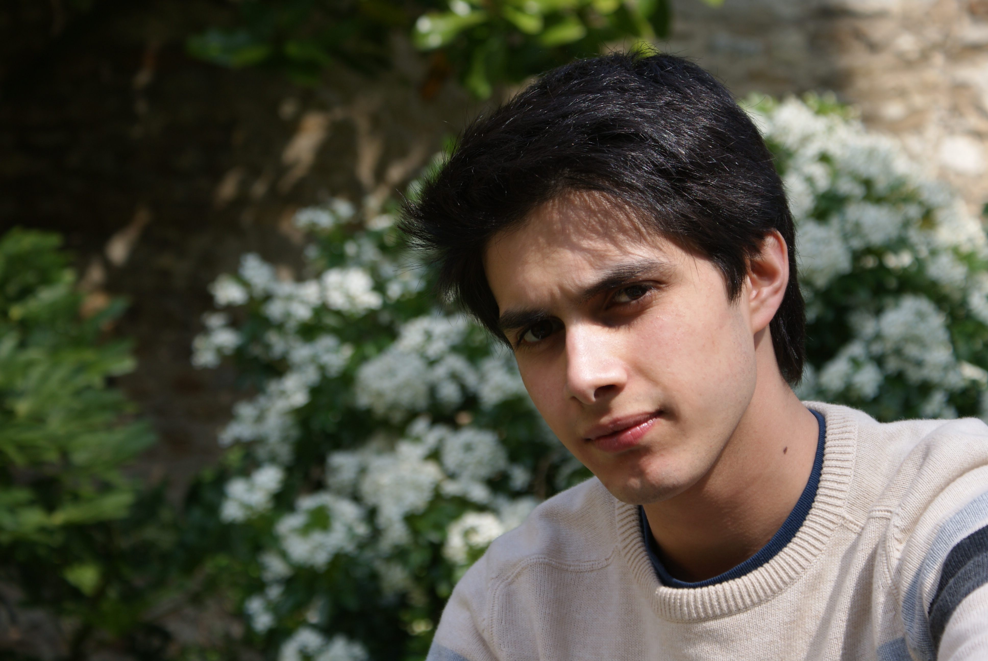
Good reference photo: the face is readable, the light is soft, and the background stays out of the way.
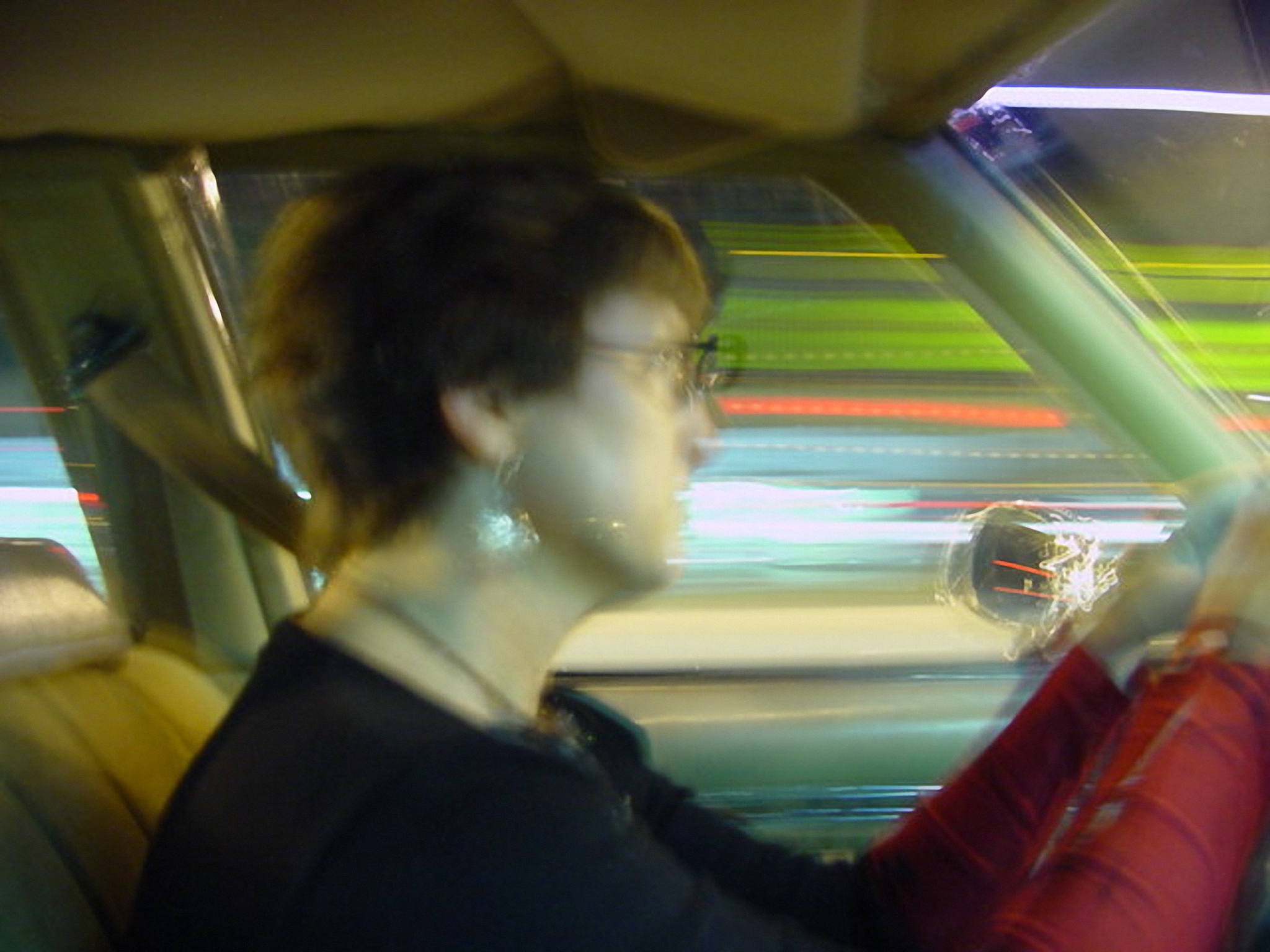
Bad reference photo: motion blur and soft detail make the features much harder to draw accurately.
If you want a quick sanity check for eye placement and focus, B&H’s guide to focusing on the eyes is a useful companion piece.
| Photo trait | Good reference | Bad reference |
|---|---|---|
| Sharpness | Eyes, nose, and mouth are easy to see. | Details smear together or disappear. |
| Lighting | Light reveals facial structure without washing it out. | Light hides features or creates harsh patches. |
| Background | Simple enough to keep attention on the face. | Busy enough to steal attention from the subject. |
| Expression | Natural and readable. | Too stiff, too dark, or lost in motion blur. |
| Usefulness for drawing | Provides enough information to draw confidently. | Forces the artist to guess too many missing pieces. |
If you want a quick memory trick, use this: a good reference photo behaves like a clear sentence. A bad one behaves like a voice note recorded inside a blender. One gives structure. The other gives you character development you did not ask for.
What to avoid when choosing a photo
Knowing what to avoid is often easier than memorizing a perfect checklist. A decent portrait reference usually falls apart for one of a handful of reasons. If you can spot those problems early, you can keep your drawing session from wandering into the weeds.
- Blurry focus: fine features disappear and the likeness becomes guesswork.
- Too much pixelation: enlarged low-quality images fall apart fast.
- Harsh flash: bright hotspots flatten the face and erase subtle shading.
- Deep shadow over the eyes: the expression becomes harder to read.
- Extreme cropping: the drawing loses context and useful edges.
- Distracting backgrounds: the face stops being the main event.
- Odd color casts: strange lighting can confuse value decisions.
Some of these problems can be worked around, but every workaround adds friction. The more the photo forces the artist to improvise, the more likely the portrait is to drift away from the subject. That does not mean imperfect photos are useless. It just means the best photo is the one that has the fewest unnecessary problems.
How I would pick a portrait photo in five minutes
If I had to choose a photo quickly, I would use this mini workflow:
- Open the photo full size and check whether the face is still sharp.
- Zoom in on the eyes, mouth, and nose to see if the important details hold up.
- Look at the background and ask whether it competes with the subject.
- Check whether the shadows show the face or swallow it.
- Ask whether this photo shows the personality I want the portrait to keep.
If the image passes those five checks, it is probably worth using. If it fails two or more, I would ask for another one. That is not perfectionism. That is protecting the drawing from avoidable chaos. Portraits are hard enough without making the reference photo behave like a prank.
What if the only photo you have is not ideal?
That happens all the time. Family photos are rarely taken with portrait drawing in mind. Sometimes the only image is an old snapshot, a phone photo from indoors, or a picture where the subject is turned a little too far. When that happens, the answer is usually to gather more than one reference photo if you can.
One photo may show the face clearly from the front, while another may show the hair, clothing, or expression better. A third photo may rescue a detail that the first two missed. Together they can create a stronger reference set than any one image alone. The key is not to overwhelm the process with twenty nearly identical photos. The key is to choose a small group that fills in the missing information.
If you are sending photos for a custom commission, it also helps to explain what matters most. Maybe the smile is the important part. Maybe the hairstyle changed later and you want the older look. Maybe the subject’s eyes are the anchor of the likeness. Good notes help the artist use the photo more intelligently instead of treating it like a mystery puzzle with extra corners.
When a studio or small portrait business needs to keep photo submissions, client notes, and approvals organized, a simple web app generator can be a practical way to shape that workflow without turning email threads into archaeological evidence.
Final tips for choosing the best photo
Here is the short version, the pocket guide, the “do this and spare yourself a headache” list:
- Choose the sharpest face you can find.
- Favor soft, even light over harsh flash.
- Pick a photo where the eyes and mouth are easy to read.
- Keep the background simple and non-dramatic.
- Use an angle that supports the likeness instead of distorting it.
- Send more than one photo if the first one leaves gaps.
- Choose images that show the subject’s personality, not just their forehead architecture.
If you remember only one thing, make it this: the best portrait photo is not necessarily the prettiest photo. It is the most useful one. The useful photo gives the artist enough clarity to draw with confidence and enough character to make the portrait feel human. That is the sweet spot. Everything else is decorative noise, which is fine for selfies and terrible for likeness.
For a broader art-world definition of a portrait, the National Gallery of Ireland’s What is a portrait? page is a tidy reminder that likeness is doing more than just looking like a face on paper.
For more portrait-related reading, the blog archive will keep growing with practical guides, and the home page gives you the main site overview. If you are ready to commission a portrait or want to understand the service side a little better, the Pencil Portrait Gifts page and the Portrait Gift Details and Information page are the best next stops.
Quick takeaway: choose a photo that is sharp, simple, well lit, and emotionally readable. Give the artist a face that wants to be drawn, not one that has to be rescued from the evidence locker.