Great reference photos don’t magically make great drawings-they just stop you from guessing. If your pencil portraits feel “almost right” but never quite match the person in the photo, the problem is usually not your talent. It’s the information you’re feeding your drawing process.
“The method is objective, not the journalist.”
You probably want answers to questions like: Which photo is actually usable? What details should you copy vs. ignore? How do you translate a 2D photograph into believable graphite? And what mistakes silently waste hours? This guide will walk through the reference-photo workflow that gets you to a likeness faster.
Artists rely on reference images because drawing is an evidence problem: you can’t fix what you refuse to observe. Drawing instruction repeatedly emphasizes seeing shape, value, and edges in a structured way-whether it’s portrait studies from photos or general drawing guidance (see, for example, Drawright’s approach to drawing from observation and value in drawing).
By the end, you’ll know how to pick higher-quality references, break photos into drawable information, and move from “photo realism” to “your portrait” without copying every flaw.
Finding quality reference photos
Start with a boring rule: a reference photo should contain the information you’ll need to draw the face-clearly, from a believable angle, with workable lighting.
Use this checklist:
- Angle: Prefer a 3/4 view or near-front view where both eyes and the nose bridge are readable.
- Lighting: Soft, directional light beats harsh flash. You want gradients (value changes), not blown-out white or crushed black.
- Focus: At least the eyes and key planes (nose, cheeks) should be in focus.
- Clarity of features: Avoid severe shadows across the eyes or heavy occlusion (hair bangs, hands, scarves) unless you’re intentionally drawing that.
- Resolution: Bigger is better. You should be able to zoom in without losing detail.
If you need a “minimum viable” reference, pick the photo that shows values and edges best, not the one that looks prettiest on a phone screen. Photographs can beautify; they can also conceal. Your job is to extract what the drawing needs.
For more on why edges and values matter, review edge (art) and light and shadow.
Analyzing details in photos
Here’s the part most people skip: analysis before drawing. Analysis is what turns “I see a face” into “I can draw this face.”
Do a 3-pass read of the photo:
- Pass 1 – Big planes: Identify the head’s main masses (forehead, cheeks, jaw). Ignore tiny features. You’re hunting the structure.
- Pass 2 – Values: Find the darkest statements (eye sockets, nostrils, under the brow) and the lightest areas (often the forehead highlight). Mark the value scale before you shade.
- Pass 3 – Edges and alignment: Check where edges are sharp vs. soft, and confirm the relationships (eye height, nose angle, mouth line). This is where likeness is usually lost.
A practical warning: photos are 2D. Your brain will try to “flatten” the face. Don’t. Treat the photo like a map of surfaces. If you can’t explain which planes are turning toward/away from the light, you don’t have enough information yet.
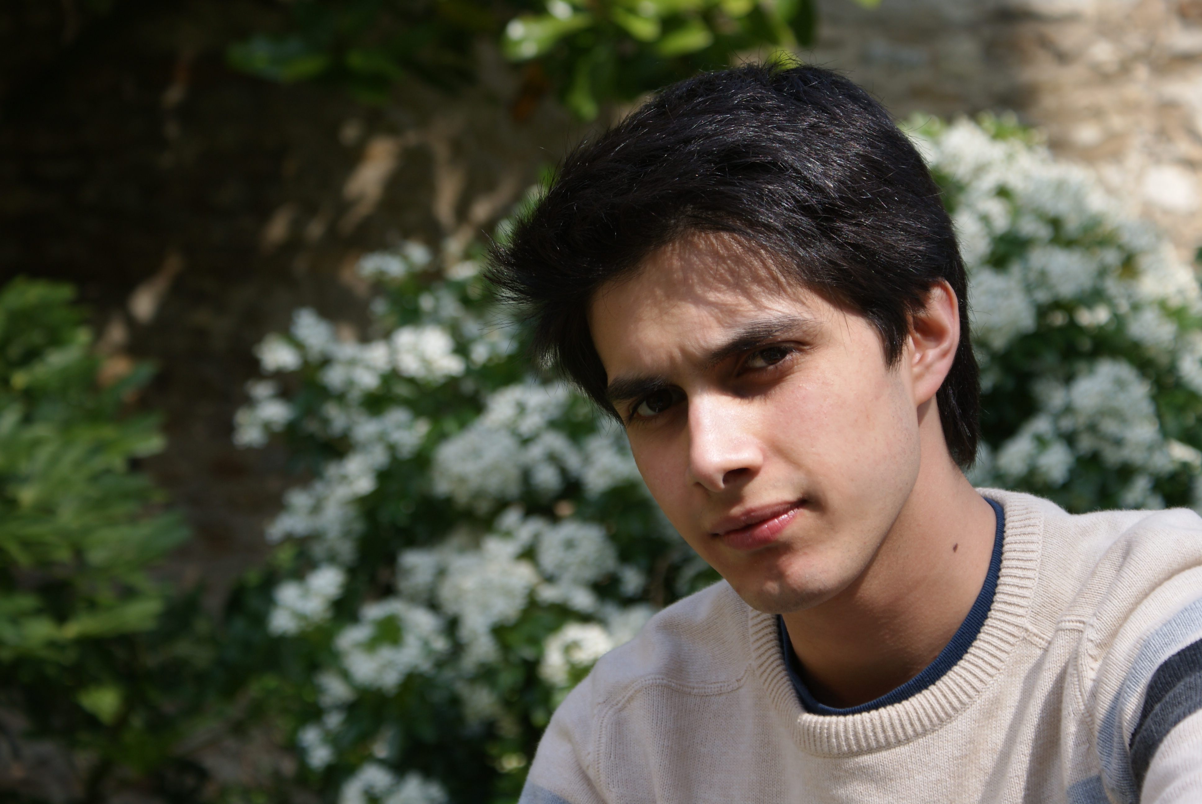
Translating photo to drawing
Now the photo stops being a picture and becomes a set of drawing tasks. The goal isn’t to copy every detail. The goal is to reproduce the relationships that make the face read as that person.