The first pencil portrait rarely looks effortless. That is part of the trade. Pencil portrait drawing becomes much easier once a beginner understands the tools, the structure of a face, and the slow way values build up on paper. The good news is that the craft does not begin with talent; it begins with a workable process.
If you are asking questions like Which pencil should I use? How do I make a face look like a face? Why does my shading look muddy? then you are in the right place. This guide keeps the focus on the practical side of pencil portrait work: materials, technique, proportion, shading, and the mistakes that usually waste a beginner’s effort. For quick reference, it also uses a few plain-language source links, including background on graphite, portrait drawing, and colored pencil.
Pencil portrait drawing matters because it sits at the intersection of observation and control. A portrait is not just a copy of a photograph; it is a study of shape, edge, light, shadow, and likeness. For readers who enjoy the gift side of this site, the same skills also explain why photo-based portrait drawings can feel so personal on the wall or in a frame. If you want to see the wider site context while you read, start with the home page, browse the blog for related articles, or read the about page to see how this site frames portrait work.
By the end, you should know what materials to buy, how to begin a simple portrait, how to shade without overworking the paper, and how to keep improving without turning the whole thing into a discouraging mess. That last part matters more than it sounds. Beginner portrait drawing is less about perfect results and more about building a stable habit.
What pencil portrait drawing means
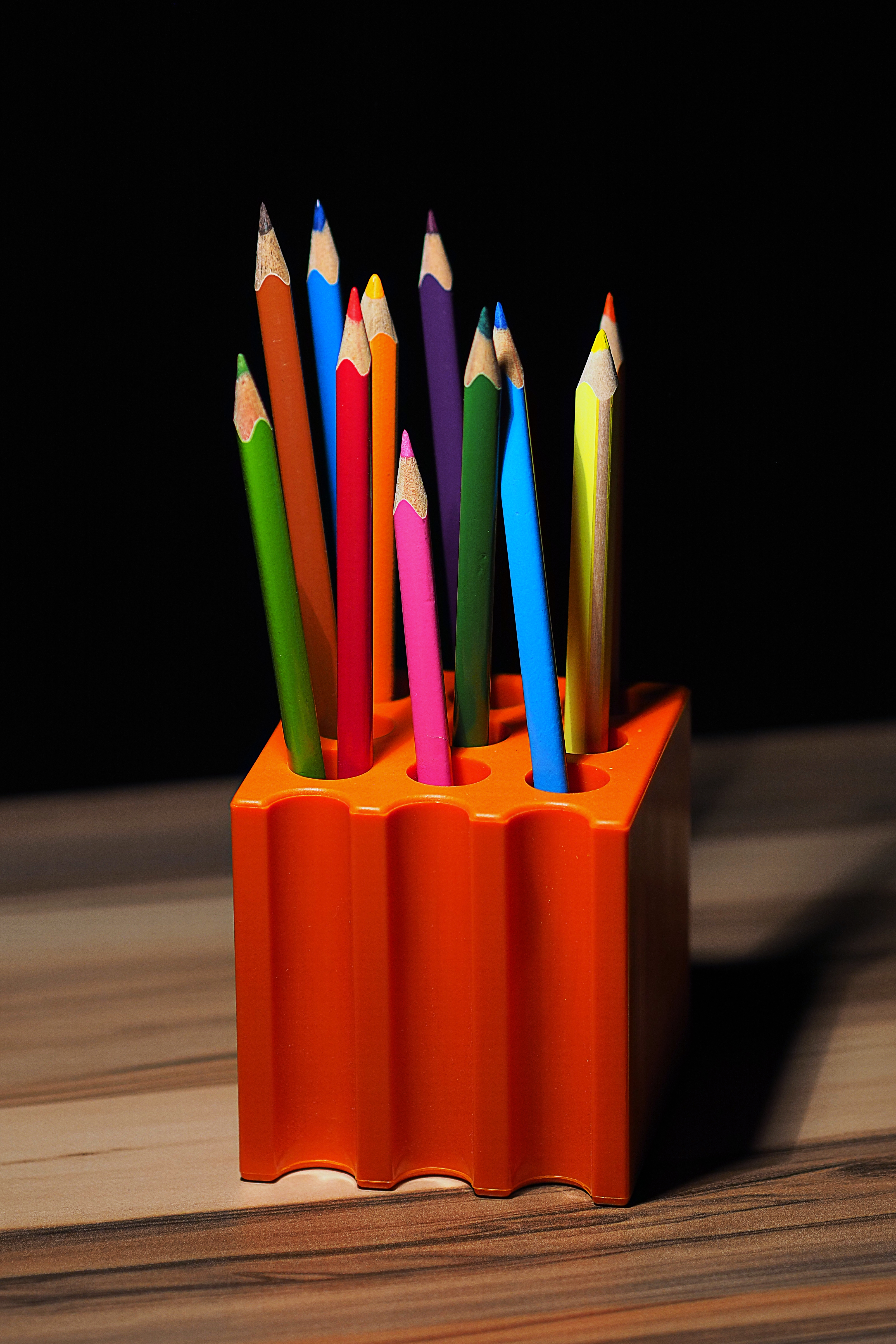
A pencil portrait is a drawing of a person, usually built from a photo or direct observation, using graphite pencil, colored pencil, or a mix of both. In simple terms, it is a portrait made with the kinds of marks a pencil can produce: fine lines, soft shading, dark accents, and subtle transitions in tone. The medium is familiar, but it is also surprisingly flexible. A beginner can start with a single pencil and paper, while a more experienced artist may build complex surfaces with several pencil grades, blending tools, and layered tones.
That flexibility is one reason pencil portraits have remained popular for so long. They are accessible, portable, and forgiving enough to teach the basics without demanding a full studio. They also force the artist to pay attention. A face drawn in pencil does not hide weak observation for very long. If the proportions drift, the likeness weakens. If the shadows are too heavy, the features flatten. If the edges are all the same, the portrait loses depth. The medium is plain, but the lesson is exacting.
Basic terms worth knowing
| Term | What it means | Why it matters for beginners |
|---|---|---|
| Graphite | The dark drawing material inside most standard pencils. | It is the backbone of most beginner portrait work because it is easy to control and erase. |
| Value | How light or dark a mark appears. | Portraits look believable when the values are grouped well, not when every area is equally detailed. |
| Proportion | The size relationship between facial features. | Good proportion keeps eyes, nose, mouth, and head shape working together. |
| Edge | The transition between one area and another. | Soft and hard edges help create depth and attention where it matters. |
| Blend | Smoothing pencil marks into a softer surface. | Useful in moderation; too much blending can erase texture and muddy the drawing. |
Essential materials for a beginner
The short version is this: you do not need a giant kit. A pencil portrait begins with a small, practical set of materials. The point is not to own everything. The point is to own enough to draw well and learn clearly. A simple kit also makes mistakes easier to diagnose. If every tool is doing something different, it becomes harder to tell what is helping and what is getting in the way.
| Material | What it does | Beginner-friendly choice |
|---|---|---|
| Graphite pencils | Create line, shading, and dark accents. | Start with HB, 2B, 4B, and 6B. That range is enough for most studies. |
| Colored pencils | Add tone, warmth, and layered color when needed. | Choose a small basic set rather than a huge box so you learn value first. More on colored pencil if you want the background term. |
| Kneaded eraser | Lifts graphite gently without tearing paper. | Use it to soften highlights, clean edges, and correct light mistakes. |
| Vinyl eraser | Removes heavier marks cleanly. | Keep one for stronger corrections, but do not scrub the paper. |
| Sharpener | Keeps points crisp for detail work. | A basic hand sharpener is fine. The important thing is a clean, steady point. |
| Smooth portrait paper | Supports fine detail and controlled shading. | Choose paper that can handle repeated pencil layers without pilling too early. |
| Blending stump or tissue | Softens transitions in broad shaded areas. | Use lightly. The tool should support the drawing, not flatten it. |
| Ruler or straight edge | Helps with layout and alignment checks. | Helpful when you are mapping the face or comparing spacing. |
It also helps to understand the pencil grades before buying too much. Harder pencils such as H or 2H make lighter, cleaner marks. Softer pencils such as 2B, 4B, and 6B make darker marks more quickly. For portraits, that range is useful because it gives you both structure and shadow. A single pencil can do a lot, but a few grades make the learning curve less frustrating.
Paper deserves more respect than beginners often give it. Portrait paper that is too rough can chew up detail, and paper that is too weak can buckle under layers. A medium-smooth drawing paper usually gives the easiest start. It is not glamorous. It is simply dependable, which is usually the better trait in a first portrait.
Basic techniques for beginners
Good pencil portrait work follows a sequence. The order matters. The face should not be shaded before the structure is clear, and the structure should not be pushed into final detail before the proportions are checked. Beginners often rush toward eyelashes and eyebrows because those details feel like progress. In reality, a portrait usually succeeds or fails much earlier, in the placement of the big shapes.
1. Start with a light outline
Begin with very light marks. Map the head shape first, then place the eye line, nose line, mouth position, and the general shape of the hair. Do not press hard. The purpose of this stage is not beauty; it is accuracy. If the outline can be adjusted freely, the rest of the portrait becomes much easier.
- Compare the width and height of the head before drawing details.
- Check whether the eyes sit level with each other.
- Watch the spacing between the eyes, nose, and mouth.
- Use small marks instead of long dark lines whenever possible.
A useful habit is to step back every few minutes and ask whether the drawing still resembles the photo in the broadest sense. The broadest sense is where beginners often get lost. A single eye that looks beautifully rendered can still sit in the wrong place and pull the whole portrait off balance.
2. Build the shadow shapes before the tiny details
Once the outline works, move to the big areas of light and dark. Think in terms of shadow shapes rather than individual hairs or pores. The cheeks, eye sockets, under the nose, under the lower lip, and around the jaw often contain the most useful value changes. If those areas are established early, the face begins to look three-dimensional before the fine detail arrives.
At this stage, keep the pencil pressure controlled. Add value slowly. It is far easier to darken a passage later than it is to lift it back if it becomes too heavy. A beginner’s most common shading error is enthusiasm. The second most common is trying to fix that enthusiasm with an eraser, which rarely improves the paper.
3. Use shading to describe form, not just color
Shading is not only about making things darker. In a portrait, shading describes the roundness of the cheeks, the angle of the nose, the curve of the lips, and the way light falls across the forehead. The marks should follow the form underneath. When the pencil movement reflects the shape of the face, the portrait gains depth.
A beginner can practice this with a simple exercise: draw a sphere or an egg shape, then shade it as if light is coming from one side. Once that feels comfortable, move to a nose, cheek, or eye socket. The same principle applies. Light creates a bright area, the form turns away, and the shadow falls where the surface stops facing the source.
For readers who like a plain definition of portrait drawing itself, the portrait article gives a broad overview of the genre. In practical terms, the important point is simpler: a portrait is a face rendered with enough structure and feeling that it reads as a person, not a diagram.
4. Refine features with restraint
Details should arrive late. Eyes, nostrils, mouth edges, eyelashes, and hair texture need accuracy, but they also need restraint. Too many dark marks in the early stages can make the portrait look stiff or overworked. A controlled portrait usually has a mix of soft and sharp edges. The focus naturally lands where the contrast is strongest.
When refining features, ask three questions before making a mark:
- Is this line really needed?
- Does this detail support the likeness?
- Will this area benefit from being softer instead of darker?
That kind of checking may sound slow, but it saves time. A portrait filled with unnecessary detail can look busy without looking accurate. The goal is not to draw every visible thing. The goal is to draw the parts that matter most for likeness and expression.
5. Control edges and contrast
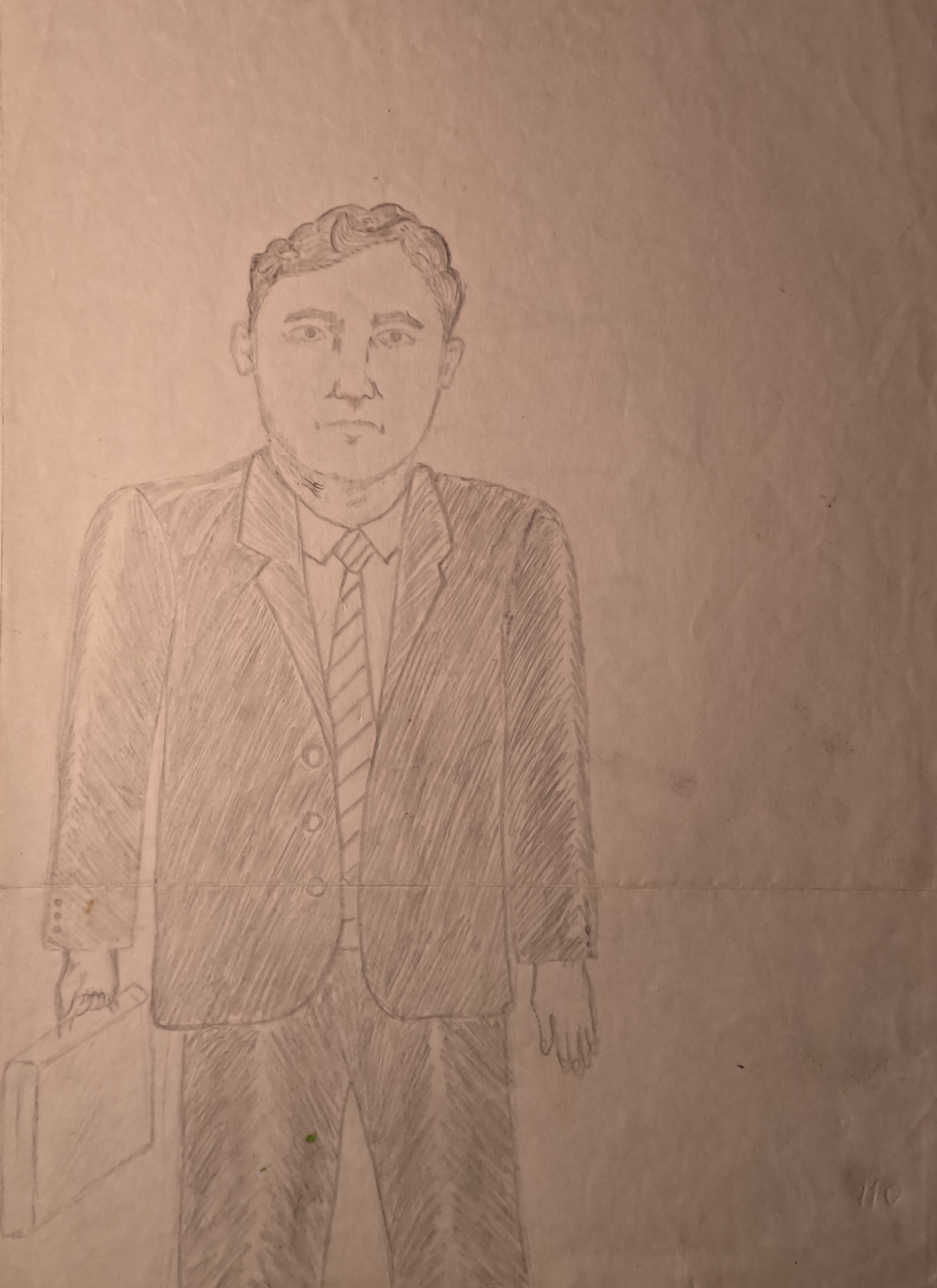
Edges are one of the easiest ways to improve a portrait without adding more complexity. Hard edges pull attention. Soft edges let the eye move on. In a face, the sharpest edges often belong near the eyes, the nostrils, the corners of the mouth, or a focal point in the hair. Softer edges often belong in the cheeks, jaw transitions, or background. This balance helps the portrait breathe.
Contrast works the same way. If every part of the drawing is equally dark and equally detailed, the image can feel flat. Reserve your darkest marks for a few important places. Leave some values lighter than you think they should be. Beginners often discover that the portrait looks more realistic when they stop trying to “finish” every square inch.
A simple step-by-step practice workflow
If you prefer a repeatable process, use the same workflow for each study until it feels normal:
- Choose a clear reference photo with good lighting and visible features.
- Lightly sketch the head shape and the main facial guides.
- Block in the largest shadow shapes first.
- Check proportions before adding detail.
- Build the mid-tones, then deepen the dark areas.
- Add final details only after the structure feels correct.
- Step back, compare, and stop before the surface becomes overworked.
That workflow sounds plain because it is plain. Plain is good. A beginner needs a process that can be repeated and corrected, not a performance that only works once. Repetition is what turns a confusing set of marks into an actual skill.
Common mistakes to avoid
Every beginner makes mistakes. The useful question is not whether they happen, but whether the artist recognizes them early enough to recover. The table below collects the usual problems and the practical fix for each one.
| Mistake | What it looks like | How to avoid or correct it |
|---|---|---|
| Overworking the drawing | The surface looks shiny, muddy, or tired from too many passes. | Use lighter pressure, stop earlier, and save the darkest accents for the final stage. |
| Ignoring proportions | The eyes, nose, mouth, or head shape do not match the reference. | Check spacing and alignment before shading. Corrections are easier while the drawing is still light. |
| Flattening the shadows | The face looks pasted on instead of round. | Think in shadow shapes and let the forms turn gradually, not abruptly. |
| Using one value everywhere | The portrait lacks contrast and becomes visually dull. | Reserve darker marks for focal points and keep some passages softer. |
| Smudging carelessly | The paper looks dirty or blurred in the wrong places. | Blend only where softness helps. Keep a clean sheet of paper under your drawing hand. |
| Practicing too rarely | Each new portrait feels like starting over. | Draw short studies often. A little repeated practice is better than one long session every few months. |
There is one more mistake worth naming separately: trying to draw the whole portrait at final intensity from the start. Beginners often chase completion before the structure is sound. The result is usually a face that is dark enough to feel serious, but not accurate enough to feel alive. The answer is patience, not more pressure.
How to practice without getting stuck
Progress in pencil portraits usually comes from a few well-chosen studies rather than one large ambitious drawing. If the first attempt feels intimidating, break the subject into smaller problems. Draw only the eyes. Then draw the nose. Then the mouth. Then a full head with simplified hair. Each study teaches something useful, and none of them has to be framed.
A good beginner routine might look like this:
- Day 1: Sketch simple head shapes from reference photos.
- Day 2: Practice shading spheres, cylinders, and cheek-like forms.
- Day 3: Draw one eye and focus on proportion and edge control.
- Day 4: Draw a nose with only three values: light, mid-tone, and dark.
- Day 5: Practice mouths and lips with soft transitions.
- Day 6: Complete a small head study without chasing perfection.
- Day 7: Compare the week’s drawings and note one thing that improved.
The point of a routine is not speed. The point is momentum. A beginner who practices a little every week will usually improve faster than someone who waits for confidence before starting. Confidence often follows evidence. Evidence comes from the drawings themselves.
When to move from study to finished portrait
There is a moment when practice turns into a complete portrait, and it is usually obvious in hindsight. The drawing feels stable. The proportions are reasonable. The values are working. The face looks like the person before the artist starts polishing the details. That is the point to keep going carefully, not to restart the whole thing because one eyebrow looks slightly uncertain. Slight uncertainty is part of the medium. The question is whether the portrait still holds together.
If the drawing is intended as a gift or keepsake, the standards change a little. You will likely want a cleaner finish, more careful likeness, and better paper handling. That is one reason many people who enjoy pencil drawing as a hobby eventually appreciate the craft behind custom portrait gifts. The technical choices are similar, but the finish carries more responsibility. For a closer look at that side of the site, the Pencil Portrait Gifts and Portrait Gift Details and Information pages explain how photo-based commissions are usually approached here.
Conclusion: keep the process simple and repeat it
Pencil portraits are learnable. They do not require magic, and they do not require an overloaded toolkit. They require a clear photo or subject, a few good pencils, paper that behaves, and a process that respects structure before detail. Once those basics are in place, the work becomes much less mysterious.
The useful takeaway is straightforward: start lightly, check proportion early, shade in layers, and save your final dark accents for the end. If something goes wrong, slow down rather than force it. If a drawing feels weak, compare it to the reference and look for the largest shape that drifted. That is usually where the fix lives.
Key points to remember:
- Begin with a small, practical set of materials.
- Draw the head and facial placement lightly before adding detail.
- Think in shadow shapes and values, not just outlines.
- Use soft and hard edges on purpose, not by accident.
- Avoid overworking the paper; stop while the drawing still feels alive.
- Practice small studies regularly, then move toward full portraits.
If you want more portrait-related reading, the blog index will collect future guides, and the about page gives a better sense of the site’s portrait focus. For many beginners, that is enough direction to keep going. The rest comes from the next drawing, which is usually the one that teaches the useful lesson.