If a portrait feels flat, the problem is usually not the pencil. It is usually the discipline: the face was not observed carefully enough, the expression was not decided early enough, or the shading was pushed before the drawing knew what it wanted to say. Emotion in portrait work is not decoration. It is structure with a pulse.
When people search for expressive portrait advice, they are usually asking the same few questions: Which facial features actually carry feeling? How do I keep a likeness while pushing the mood? What should I do first when the eyes look dead? And why does one drawing feel alive while another feels technically correct and emotionally absent? John Singer Sargent put the cost of the problem in one clean line: “Every time I paint a portrait I lose a friend.” That is not melodrama. It is a reminder that a portrait has to hold on to a real person, not just a set of measurements.
The reason this matters is not mysterious. A portrait is, by definition, a representation of a particular person, and research on facial expression and emotion keeps making the same point in a more scientific register: tiny shifts in the face carry a lot of emotional meaning. If the face is where the meaning lives, then the artist has to treat the brow, eyes, mouth, and head angle as decision points, not afterthoughts.
By the end of this guide, I want you to be able to do four things with more confidence: read expression more clearly, translate it into graphite without flattening it, study a few strong examples without copying them mechanically, and practice in a way that actually changes your drawings. If you want to keep browsing the site while you read, the home page gives the broader site context and the blog index gathers the rest of the portrait articles in one place.
What I mean by emotion in a portrait
I do not mean a cartoon face with an exaggerated smile or a theatrical frown. I mean the quieter and more reliable signals that make a viewer feel something before they can name it. A portrait feels expressive when the drawing preserves the subject’s state of mind, not when every part of the face is equally loud. A good portrait can be calm, guarded, tired, hopeful, proud, grieving, amused, or conflicted. The job is to decide which emotional signal matters most and protect it from the rest of the drawing.
That is why I think of emotion as a hierarchy. Some marks matter more than others. The eyes usually matter more than the hair. The mouth usually matters more than the cheek texture. The head tilt often matters more than the clothing. If you put the emphasis in the wrong place, the portrait can still be well drawn and still feel wrong. That is a respectable failure, which is a very expensive kind.
Terms worth keeping close
| Term | Plain meaning | Why it matters in expressive portrait work |
|---|---|---|
| Expression | The visible arrangement of features that suggests mood or feeling. | It is the fastest route from anatomy to personality. |
| Value | How light or dark a mark appears. | Value sets the emotional temperature of the face. |
| Edge | The transition between two areas. | Hard edges create focus; soft edges create tenderness or distance. |
| Asymmetry | Small differences between the left and right side of the face. | Natural asymmetry keeps the portrait from looking frozen. |
| Microexpression | A small, brief facial signal that hints at an inner feeling. | These tiny cues are where subtle emotion often hides. |
| Likeness | The degree to which the drawing still feels like the subject. | Likeness is the non-negotiable contract of portrait work. |
If a term feels abstract, reduce it to a practical question: what feature am I adjusting, and what feeling does that adjustment communicate? That question is the difference between a face and a mood.
Understanding facial expressions
A face is not a flat mask. It is a moving system of small tensions, and the viewer reads those tensions whether the artist intends it or not. The brow can signal concern before the mouth changes. The eyes can signal fatigue before the rest of the face does. A slightly compressed lip can turn a friendly expression into guarded restraint. These are small changes, but drawing lives in small changes.
The practical problem is that beginners often chase the wrong evidence. They render eyelashes, hair, and lips as if those details alone will create emotional force. They will not. Emotion usually arrives through structure first and detail second. If the eye sockets, mouth shape, brow line, and head angle do not support the mood, no amount of extra pencil work will save the portrait. Graphite is talented, but it is not a negotiator.
Eyes and brows
The eyes are the first place I check because they control attention. Open eyes with clear catchlights can suggest alertness or openness. Narrowed lids can suggest skepticism, fatigue, or controlled intensity. Brows pushed high can read as surprise or vulnerability. Brows drawn inward can create tension, concentration, or worry. The difference between these signals is often not large, which is why the drawing has to be precise rather than dramatic.
A useful habit is to ask what the upper face is doing before you finish anything else. If the brows are relaxed but the mouth is tense, the portrait can feel divided. If both are trying to shout, the drawing starts to look staged. A good expression usually has one dominant note and a few supporting notes.
Mouth and jaw
The mouth is where people often overstate emotion. That is understandable; the mouth is easy to spot, and it seems like the most obvious place to put feeling. In practice, the mouth is only one player. A smile without cheek lift can feel forced. A frown without eye tension can feel theatrical. A compressed jaw can signal restraint, but only if the rest of the face agrees.
When I draw the mouth, I treat it as a hinge. It does not merely display mood; it connects the lower face to the rest of the head. That means the line of the lips, the shadow under the lower lip, and the relationship to the chin all matter. If the jaw is too soft, the feeling can vanish. If it is too hard, the face can become stern when I meant thoughtful.
Head angle and asymmetry
Emotion is rarely symmetrical in real life. One brow may rise more than the other. One side of the mouth may carry more weight. The head may tilt with a kind of natural uncertainty or confidence. These small asymmetries matter because they stop the portrait from looking like a diagram. Real faces are not built from perfect mirror logic, and the more I respect that, the more believable the drawing becomes.
Head angle is especially important because it changes the whole emotional read. A slightly lowered head can feel reflective or sad. A lifted chin can feel firm, proud, or defensive. A head turned away can create distance or privacy. None of these signals requires melodrama. They just require attention.
Value and edge control
Emotion does not live only in anatomy. It also lives in the way light enters and leaves the face. Softer transitions can make a portrait feel quiet or intimate. Sharper contrast can make it feel alert or severe. If the value range is too even, the portrait can feel emotionally neutral even when the expression is technically correct.
Edges do some of the same work. A sharp edge around the eyes can create focus. A softened cheek edge can suggest tenderness or fatigue. A more controlled jawline can convey determination. I do not use edge control to fake feeling. I use it to make the feeling legible.
Techniques for capturing emotion
There is no single trick that makes a portrait expressive. If there were, the rest of the craft would be an industry of shortcuts and regrets. What works instead is a sequence of small decisions. I decide the mood first, build the structure second, and refine the emotional cues last. That order keeps me from polishing the wrong thing too early.
1. Decide the emotional target before you shade
Before the pencil gets busy, I want a sentence for the portrait. Not a poem. A sentence. For example: “quiet grief after a long day,” “contained confidence,” “soft amusement,” or “restless concentration.” That sentence becomes the filter for every later decision. If a shadow or edge does not support the sentence, I rethink it.
This matters because emotion is not generic. A portrait that tries to express everything usually ends up expressing nothing. Pick one dominant feeling and one supporting feeling. That is enough. People are not spreadsheets with cheeks.
| Emotional goal | What I emphasize | What I avoid |
|---|---|---|
| Tenderness | Soft edges, relaxed brows, gentle transitions around the cheeks. | Hard contour lines and overly sharp contrast. |
| Anxiety | Compressed mouth, lifted or knitted brows, tighter values around the eyes. | A smile that contradicts the tension elsewhere. |
| Grief | Heavier shadows, reduced contrast in the background, a lower gaze or inward tilt. | Overly bright highlights that make the face feel cheerful by accident. |
| Confidence | Stable head angle, clean structure, a clear jawline, controlled focal contrast. | Too much softness around the mouth and eyes. |
| Defiance | Sharper brow lines, firmer mouth shape, slight asymmetry, stronger silhouette. | Symmetry so perfect it removes the tension. |
2. Build the structure before the mood
I know that sounds less romantic than most art advice. That is because it is true. Expression sits on top of structure, and structure is where likeness either survives or collapses. If the eye spacing is wrong, the face can look emotionally “off” even if the shading is beautiful. That is not a mystery. It is geometry with consequences.
So I start with the head shape, the centerline, the eye line, the nose placement, and the mouth relationship. Then I check those placements against the reference before I commit to detail. Only after the base structure is stable do I move to the cues that shape emotion. This is the discipline that keeps a portrait from becoming a stylish but unconvincing face.
3. Use asymmetry on purpose
Symmetry is seductive because it looks tidy. The problem is that tidy is not the same thing as alive. I use slight asymmetry to keep the portrait human. One eye can open a little more than the other. One brow can rise just enough to alter the tone. One corner of the mouth can carry more weight. These differences should be subtle, but they should be there.
The trick is restraint. Too much asymmetry becomes distortion. Too little becomes stiffness. The best portraits feel balanced because the imbalance is controlled. That is one of the least glamorous truths in art: the face looks alive when the artist knows where not to be perfect.
4. Let contrast carry the mood
Value contrast is one of the fastest ways to direct feeling. Higher contrast often feels more dramatic, more alert, or more urgent. Lower contrast can feel softer, more reflective, or more muted. The point is not to make every expressive portrait dark. The point is to make the contrast serve the emotional target.
When I want a quieter result, I keep the transitions smoother and avoid punching every shadow to the edge of black. When I want intensity, I sharpen select areas around the eyes or brow and allow the darks to do more work. Contrast is not just a technical choice. It is a tone of voice.
For a practical photography parallel, Canon’s portrait posing guidance is a reminder that the body and face communicate together. A head angle that supports the subject’s mood makes the drawing easier before the pencil ever touches the paper.
5. Reserve the strongest marks for the focal point
Not every mark should compete for attention. If the eyelashes, brows, mouth, and hair all get the same level of contrast, the viewer’s eye has nowhere to rest. I usually decide where the emotional focal point is and place my strongest marks there. Often it is the eyes. Sometimes it is the mouth. Occasionally it is the line of the brow or the tilt of the head.
That focal decision is important because emotional clarity depends on hierarchy. The viewer should immediately understand where to look first and why. If the face is a board meeting, one person has to chair it. Otherwise the drawing spends all its time arguing with itself.
Examples of expressive portraits
It helps to look at artists who already solved the problem in different ways. I am not interested in copying them line for line. I am interested in what each example teaches about emotional emphasis, restraint, and structure. These are not museum trivia items. They are working demonstrations of choices that still matter in graphite today.
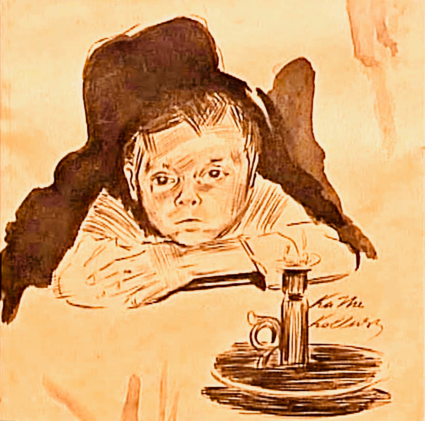
Käthe Kollwitz and emotional gravity
Kollwitz is a strong example because her work often distills feeling instead of overexplaining it. Her portraits and self-portraits tend to carry emotional weight through line, value, and restraint. She does not rely on decorative flourish. She relies on the face holding a burden. That is a very different thing.
The lesson I take from her work is simple: emotion becomes stronger when the drawing trusts reduction. A few honest marks can say more than a crowded surface. The face does not need to be dramatized into submission. It needs to be observed with enough seriousness that the feeling stays visible. The MoMA collection page for Käthe Kollwitz is worth a look if you want to see how a consistent emotional voice can run through an artist’s work.
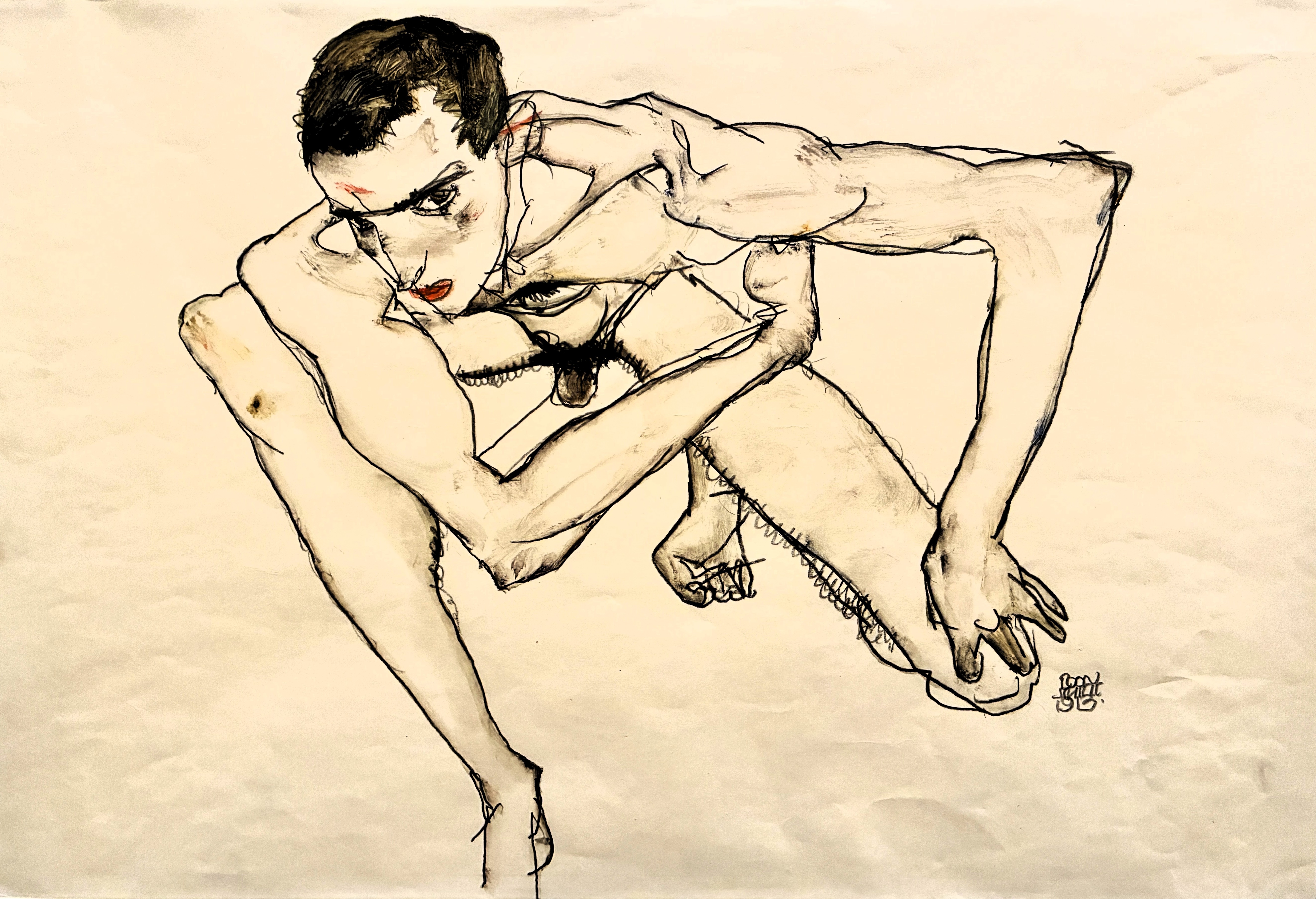
Egon Schiele and tension in the line
Schiele is almost the opposite lesson. Where Kollwitz often compresses emotion into solemn restraint, Schiele leans into angularity, exposed structure, and the sensation that the figure is just slightly unsteady. His self-portraits are useful because they show how emotional force can come from tension rather than smoothness. The line itself can feel anxious, sharp, or exposed.
The important part is that the tension is not random. It is controlled. The body, face, and negative space all contribute to the mood. If you want a portrait to feel uneasy, alert, or psychologically open, a little compositional strain can do more than a pile of shading. The Leopold Museum’s Egon Schiele collection page shows how central that expressive intensity is to his work.
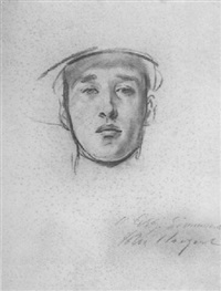
John Singer Sargent and restraint
Sargent is useful because he proves that expressive portraits do not always need to shout. In many of his works, the emotional effect comes from control: the pose, the lighting, the economy of mark, and the way the face is allowed to breathe inside the composition. His drawings and paintings show that understatement can be as expressive as intensity when the structure is clean.
That matters for pencil work because many artists think emotion requires heavy contrast or dramatic exaggeration. It does not. Sometimes the strongest move is to keep the expression quiet and let the viewer find the feeling in the arrangement. The Met’s essay on John Singer Sargent is a useful reminder that portraiture can be both refined and emotionally direct.
What these examples teach together
- Kollwitz shows how restraint can hold deep feeling.
- Schiele shows how tension and asymmetry can sharpen mood.
- Sargent shows how economy can keep a portrait alive without overstatement.
That combination is useful because it covers three different expressive strategies. If you only study one, you may start to think emotion has a single visual language. It does not. The better question is which strategy supports the face you are drawing and the feeling you want the viewer to read first.
Practice exercises that actually improve expression
I do not trust practice that is vague. “Draw more” is not a plan. It is a slogan. The exercises below are specific because emotional drawing improves when you can compare one decision to another. That comparison is the whole game. Without it, you are just making similar marks and hoping one of them matures into wisdom.
Exercise 1: The three-expression study
Pick one reference subject and draw them three times with three different emotional targets. Keep the proportions as close as possible. Change only the cues that support the mood. For example: one version can be calm, one concerned, and one reserved. This forces you to separate likeness from expression, which is a valuable distinction.
What this trains: emotional control, feature hierarchy, and restraint. The drawing improves because you learn which changes matter and which ones only create noise.
Exercise 2: Eyes and brows only
Crop the reference so you can see only the eyes, brows, and the top of the nose. Draw that small area several times. Focus on value, angle, and edge softness. The goal is to learn how much feeling lives in the upper face before the mouth ever enters the conversation.
What this trains: focus, subtlety, and eye-region observation. It also keeps you from leaning too hard on the mouth when the eyes are already doing the work.
Exercise 3: Two-value portraits
Make a portrait using only light and dark shapes. No middle-finish, no fussy blending, no rescue detail. This forces the expression to read from the large structure instead of from texture. If the portrait feels alive in two values, it usually becomes stronger when the full range is added.
What this trains: simplification and emotional clarity. The face either holds together or it does not. There is nowhere to hide, which is refreshing in the way a tax audit is refreshing.
Exercise 4: Mirror the drawing
Flip the drawing horizontally or look at it in a mirror. This makes proportion errors and emotional contradictions easier to see. A portrait can feel emotionally confused simply because one eye sits too high or the mouth tilts in a direction that contradicts the intended mood. The mirror check exposes that quickly.
What this trains: objectivity. It is much easier to fix an emotional problem once you can see that it is actually a structural problem.
Exercise 5: Draw the same face at three speeds
Do one study in ten minutes, one in thirty, and one in ninety. The fast version teaches you what the essential emotional cues are. The middle version teaches you where to refine. The longer version teaches you where patience improves the drawing and where it only inflates it. This is one of the best ways to find the difference between signal and decoration.
What this trains: judgment. A portrait artist needs to know when to stop. That skill is not glamorous, but it is profitable in the most literal sense of the word: it saves time, paper, and dignity.
Keeping the process orderly when portraits become commissions
Once portrait work stops being a hobby and starts becoming a stream of client requests, process matters almost as much as pencil control. Photo intake, reference selection, notes about expression, approval steps, and delivery details all need somewhere to live. Some studios use AI integration services to connect enquiry forms, image uploads, and admin workflows so the drawing work does not get buried under email chains. That is not a replacement for the artist; it is just a way to keep the paperwork from becoming the loudest person in the room.
What I want you to remember
Expressive portrait drawing is not about adding more drama. It is about making better decisions earlier. The right emotion starts with a clear intention, a usable reference, and a structure that can hold the face together before the details arrive. After that, the portrait lives or dies by a few controlled choices: the eyes, the mouth, the head angle, the edge quality, and the value range.
If you remember nothing else, remember this: emotion is not glued onto a portrait at the end. It is built into the portrait from the beginning. Once you accept that, your drawings stop looking like copied faces and start looking like people. That is the whole point.
Conclusion
When I draw for expression, I do not ask how much detail I can squeeze into the face. I ask what the face is already trying to say and what the drawing needs to do to preserve that message. The answer is usually quieter than beginners expect. It is a better eye angle, a cleaner value structure, a more honest mouth line, or a little more restraint in the shadow.
That is the practical path. Decide the feeling, protect the structure, emphasize the right cues, and practice in small repeatable studies. If you want more portrait guidance, the blog index keeps the related articles together, and the home page gives the main site entry point. From there, the work is simple: choose the next face, decide what it should feel like, and draw with enough control to let that feeling survive the trip to paper.
Key points to keep in mind:
- Emotion in portraits comes from structure, not decoration.
- The eyes, brows, mouth, and head angle carry the strongest cues.
- Asymmetry and contrast are tools, not goals.
- Examples from Kollwitz, Schiele, and Sargent show different expressive strategies.
- Small, repeatable practice studies improve emotional clarity faster than vague repetition.