Light is the first thing I study in a portrait, because it decides what the eye believes before the pencil has a chance to explain anything.
When I open a reference photo, I usually ask the same four questions: Where is the light coming from? What is being pushed into shadow? Which edges should stay crisp, and which should soften? What values carry the feeling of the face? Those questions sound simple, but they do most of the heavy lifting in a finished pencil portrait.
If you want a neutral definition before we get practical, the National Gallery describes chiaroscuro as clear tonal contrast used to suggest volume and modeling, The Met has a useful look at chiaroscuro woodcuts in its art history guide, and a plain-language cross-check of value in art is useful when you are thinking about tonal range. Those are broader art references, but they point to the same core idea: light and shadow give a flat surface the feeling of form.
In this article, I will define the basic terms, show how to read lighting in a photo, compare shading methods, and walk through a few examples of effective value structure. If you want the wider site context, start at the home page or browse the blog index. If you are choosing images for a commission, the Portrait Gift Details and Information page is the practical companion.
The Basics of Light and Shadow
In portrait drawing, light and shadow are not just surface effects. They are the structure that tells us where the face turns in space. I think of them as the invisible architecture of the likeness. The features matter, of course, but the values around those features tell the viewer how the face sits, how far it turns, and how solid it feels.
At the simplest level, light is the area receiving the strongest illumination from the source, and shadow is the area receiving less or none of that direct light. Between those two ends sits a range of middle values, and that range is where a portrait usually becomes convincing. If the drawing jumps too quickly from white paper to dark graphite, the face can feel cut out. If the values stay too close together, the portrait can look flat and unfinished.
One reason this matters so much is that the human eye reads contrast as form. A cheek that gradually turns away from the light tells the viewer more than a carefully outlined cheekbone ever could. The same is true for the bridge of the nose, the brow, the lips, and the chin. In practice, that means a good portrait often depends less on outline than on the measured placement of value changes.
| Term | What it means in a portrait | Why it matters |
|---|---|---|
| Light source | The direction the illumination comes from, such as window light or overhead light. | It tells you where highlights and shadows should fall. |
| Highlight | The brightest visible area on the form. | It helps establish the shape of the forehead, nose, cheek, or lip. |
| Halftone | The middle value between highlight and shadow. | It creates the smooth turn of the form. |
| Core shadow | The darkest part of the shadow side of the form. | It gives the face weight and depth. |
| Cast shadow | The shadow thrown by one form onto another, such as the nose casting onto the cheek. | It separates features and clarifies direction of light. |
| Reflected light | Light bouncing back into the shadow side from surrounding surfaces. | It keeps shadows from becoming dead black. |
If you are still new to value thinking, the useful move is to stop calling everything “dark” or “light” and start naming the role each value plays. A shadow that describes a cheek turn is not the same as the dark under a lower lip. A highlight on the forehead is not the same as the lighter edge of a reflected light. Once you can tell those apart, your drawings get calmer and more deliberate.
That does not mean every portrait needs dramatic contrast. Some of the most believable pencil drawings use a narrow value range. What matters is not how dark you can go, but whether the values agree with the light source. A quiet portrait with soft window light can be just as effective as a high-contrast study, as long as the form reads clearly.
How to Observe Lighting in Photos
When I look at a reference photo, I do not begin by tracing the outline of the face. I begin by mapping the light. That habit saves time later, because it keeps me from drawing details that do not belong to the lighting setup. It also prevents a common beginner mistake: treating every reference photo as if the face were evenly lit. Very few portraits are.
Start with the most obvious question: where is the light source? If the source is left of the subject, the left side of the face should usually carry the strongest light. If the source is high, the brow, nose, and upper cheek planes often catch it first. If the source is soft and broad, the transitions should be gentle. If the source is hard and narrow, the shadows may fall quickly and with sharper edges.
Then ask what kind of light you are seeing. Window light behaves differently from flash. Overcast outdoor light behaves differently from a desk lamp. Side light can flatten one side of the face into a strong shadow shape, while front light can reduce obvious contrast and make subtle modeling more important. There is no single ideal answer here; there is only the answer that matches the photograph in front of you.
A simple observation routine
- Squint at the photo until the details soften and the large value shapes become clearer.
- Mark the lightest area, usually a highlight on the forehead, nose, cheek, or chin.
- Find the darkest connected shadow shape, then compare it to the background and hair.
- Check the transition zones where the face turns from light into middle value.
- Look for cast shadows under the nose, chin, and lower lip.
- Notice where reflected light softens the shadow side without removing its depth.
This routine seems almost too plain to matter, but it is the kind of plain work that keeps a portrait accurate. I would rather spend a few extra minutes identifying the major shapes than spend an hour trying to fix a nose that looks pasted on.
It also helps to turn the reference photo upside down or flip it horizontally. That trick makes the face less familiar and the value pattern more obvious. When the brain stops naming the subject and starts seeing shapes, mistakes become easier to catch. The eye sees the drawing as a pattern of tones before it sees it as a person, which is exactly what you want during planning.
When choosing a reference photo, look for clear structure rather than photographic perfection. A good reference does not have to be glamorous. It does need to show enough contrast to describe the planes of the face, and enough resolution to preserve the details you care about. If a face is lit so evenly that the nose, eye sockets, and cheeks all sit on the same value plane, the drawing can still work, but you will need to create more of the modeling yourself.
That is why I tend to prefer photos where one side of the face is lit more strongly than the other. The asymmetry gives the drawing a natural sense of depth. It also tells me where to leave paper untouched and where to build graphite slowly. In a portrait commission, the photo does not have to solve everything. It only has to give the drawing a useful starting map.
For readers who want to compare photos more carefully, the Portrait Gift Details and Information page is a good reminder that lighting, expression, and clarity all matter at the same time. If the source image is muddy, the drawing usually spends too much time guessing. If the source image is clear, the pencil can do the quieter work of interpretation.
What to avoid in a photo
- Flat front light that removes plane changes from the face.
- Mixed light sources that create competing shadow directions.
- Harsh flash that erases soft transitions and makes skin look shiny.
- Motion blur that hides the edges you need for the eyes, mouth, or hairline.
- Extreme crop decisions that cut away the shape of the head or shoulders without intention.
None of those problems make a portrait impossible. They just make the job harder. If you have to work from a difficult photo, the answer is not to pretend the lighting is better than it is. The answer is to simplify carefully and decide which information deserves emphasis. That is a discipline, not a trick.
Techniques for Shading
Once the lighting is understood, shading is the part where the drawing starts to breathe. I think of shading as the act of translating light into a sequence of value decisions. The goal is not to fill the paper with graphite as quickly as possible. The goal is to place each mark where it helps the face turn in space.
Different shading methods can do very different jobs. Some are better for smooth skin transitions. Some are better for expressive texture in hair, clothing, or beard stubble. Some let you build value quickly, while others keep the surface delicate. A good portrait often combines more than one method, because the face itself is not uniform.
| Method | Best use | Practical note |
|---|---|---|
| Hatching | Building controlled tone with repeated parallel lines. | Useful when you want the structure of the marks to stay visible. |
| Cross-hatching | Deepening value by layering a second direction of lines. | Good for darker shadow areas and more textured surfaces. |
| Blending | Creating smooth transitions across cheek, forehead, and jaw. | Use lightly so the drawing does not become muddy. |
| Layering | Gradually increasing tone through several passes. | Helps you keep the value range under control. |
| Eraser lifting | Bringing back highlights on the nose, lip, eye, or hair. | Works best after the base values are established. |
Hatching and cross-hatching are often underestimated by beginners because they look obvious on the page. Yet that obvious structure can be an advantage. It keeps the artist honest about value and avoids the plastic, overblended look that sometimes happens when graphite is rubbed around too early. If you want a portrait to keep some life, let the marks keep a little of their own character.
Blending has its place too, but I use it with caution. A smoothly blended cheek can look elegant, but if every area is softened equally, the portrait loses edge hierarchy. You need some crisp transitions and some gentle ones. The face is not built from one texture. The eyebrow, the upper lip, the nostril, and the side of the nose all ask for slightly different treatment.
A practical shading sequence
- Block in the shadow family first, using light pressure and broad shapes.
- Establish the largest halftone areas so the face starts to turn.
- Protect the highlights by leaving the paper clean or by lifting graphite later.
- Deepen the core shadows in small steps rather than one heavy pass.
- Refine edges only after the value structure is solid.
- Use an eraser or a kneaded eraser to recover small points of light.
This sequence is useful because it keeps the drawing from getting ahead of itself. A portrait that starts with eyelashes and ends with values usually feels backwards. A portrait that starts with value structure and ends with details usually feels settled. The face becomes believable before the eyelashes arrive, which is the better order of events.
One of the most useful habits I have kept is to compare every new shadow against the darkest shadow already on the page. That comparison stops me from overdarkening areas that should remain midtone. It also reminds me that not every shadow should be equally black. The eye socket may be deeper than the cheek shadow, while the shadow under the chin may be darker still. The point is to let the values do their relative work.
Erasers are not only for mistakes. They are tools for shaping light. A small lifted line across the nose bridge can make the form turn. A touch of lifted tone on the lower lip can separate it from the shadow beneath it. A careful highlight in the eye can restore life to the portrait after several layers of graphite have settled in. Used well, the eraser is not an apology. It is a precision instrument.
If your studio workflow has to manage reference photos, client notes, and order files across several tools, a guide to AI integration services can be a useful operations reference. The drawing itself still depends on patient observation, but the admin around the drawing does not have to be chaotic.
Examples of Effective Light and Shadow Use
Examples help because they show the same principles in different clothes. A portrait with dramatic side light can teach you one lesson. A softer drawing with a narrow value range can teach another. I find it useful to look at both, because the habits do not transfer automatically. The artist must decide what kind of light the subject needs, not just what kind of contrast is easiest to admire.
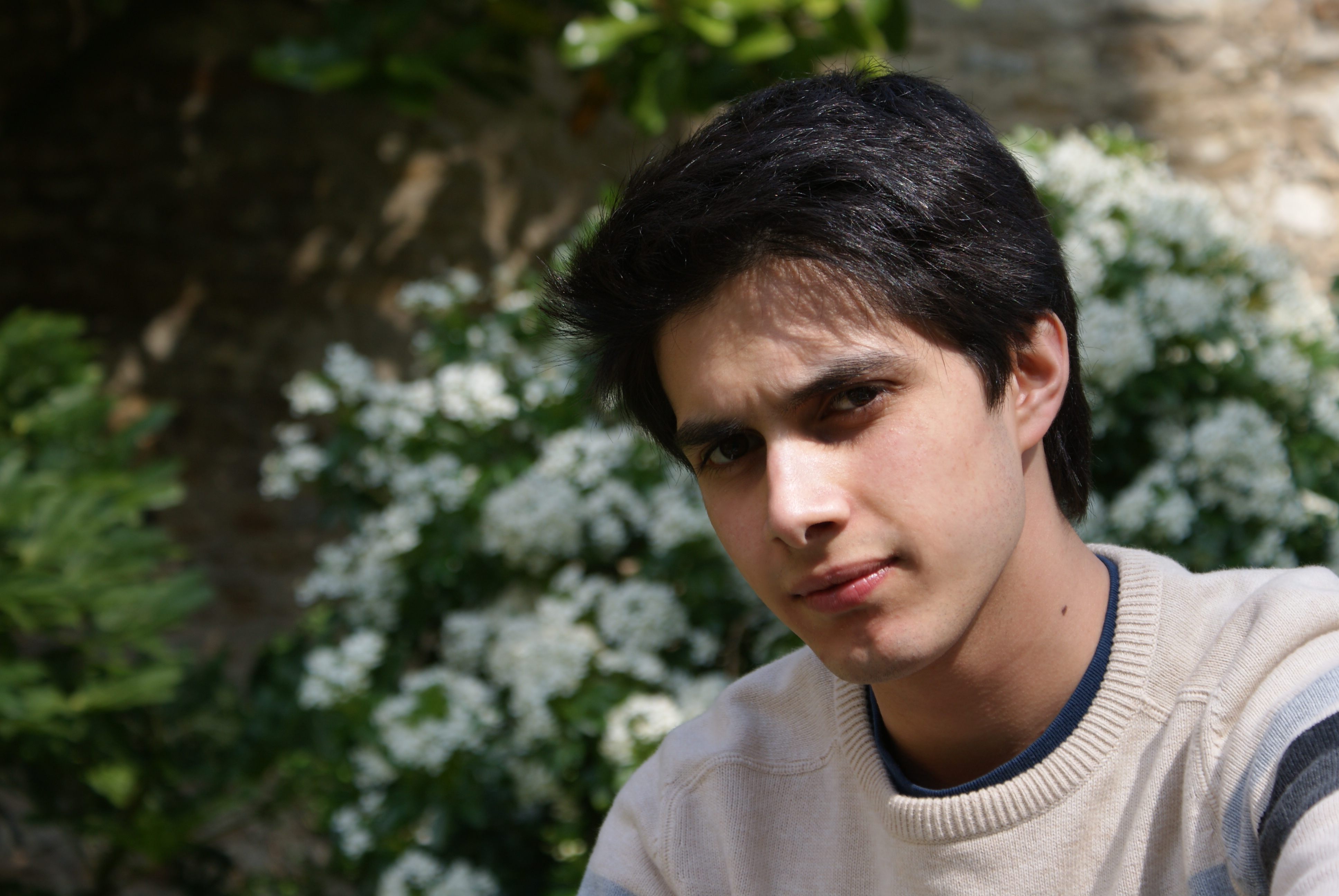
The image above is useful because the lighting defines the face without flattening it. You can read the brighter side of the face, the darker turn away from the light, and the transition between them. That is exactly what a good pencil portrait needs at the planning stage. The shadow side is not just “dark”; it is a map of planes receding from the light source.
When I study an image like this, I look first at the broad pattern. The hair, forehead, cheek, nose, and jaw all sit in a value relationship with one another. Then I look at the small decisions inside that structure: where the nose casts a shadow, where the eye socket turns, where the mouth softens into the face, and where the edge of the jaw needs to disappear instead of being outlined. The portrait gets its realism from those decisions, not from a thick contour line.
You can also learn a lot from older graphite studies and museum drawings. The point is not to copy a style letter for letter. The point is to notice how different artists use shadow to steer attention. Some hold back detail in the background so the face feels forward. Some sharpen the eyes and soften the hair. Some leave parts of the cheek barely touched so the paper becomes part of the light. The common thread is restraint.
A few things I watch for when studying strong examples:
- Is the darkest dark reserved for the most important shadow, or spread everywhere?
- Does the artist keep one or two clean highlights to anchor the form?
- Are the edges harder where the viewer should focus, and softer where the form turns away?
- Does the shadow shape explain the structure of the face instead of hiding it?
Those questions matter because a portrait can have strong contrast and still feel quiet, or it can have limited contrast and still feel precise. The measure is not drama for its own sake. The measure is whether the light reads as believable. When the light is believable, the face begins to carry weight without obvious effort.
For more examples and related articles, the blog index is the easiest place to browse onward. If you want to see how these value ideas connect to finished portrait gifts, the Portrait Gift Details and Information page gives a practical next step.
Putting It All Together
Light and shadow do not sit on top of a portrait as decoration. They define the portrait’s structure. The more clearly you understand the source of the light, the easier it is to draw a face that feels solid, calm, and alive. That is true whether you are working from a quick sketch, a careful commission, or a long studio study.
If I had to reduce the whole process to a short working rule, I would say this: observe first, shade second, detail last. Observation keeps the drawing honest. Shading gives it depth. Detail gives it presence. When the order gets reversed, the portrait usually starts to wobble.
There is also a second rule that matters just as much: do not chase darkness before the structure is in place. A strong portrait is not simply a dark portrait. It is a portrait where the values have a reason to exist. The highlight belongs where the light strikes. The shadow belongs where the form turns away. The middle values tell the viewer how the skin, bone, and soft tissue connect.
For practice, I suggest a small exercise: choose one photo with side light, one with soft front light, and one with mixed lighting. Make a simple value map of each before drawing any features. Mark the lightest areas, the core shadows, and the cast shadows. Then compare how the face changes from one lighting setup to another. That exercise teaches more than a stack of random sketches, because it forces you to see the role of light, not just the outline of the subject.
The useful takeaway is simple. If you can read the light, you can build the portrait. If you can control the shadows, you can shape the likeness. And if you can keep the values honest, the drawing will usually take care of the rest.
Browse the home page if you want the main site overview, or return to the blog index for more practical notes on portrait drawing and reference choice.