Proportions are the quiet difference between a portrait that looks “almost right” and one that instantly feels like the person.
“We can have the most beautiful drawing, but without correct proportion it will still feel wrong.”
From the drawing concept of visual proportion: see Wikipedia, “Proportion (visual arts)”
When you search for pencil portrait help, you usually end up asking:
Where should the eyes actually sit? How do I measure proportions from a photo? What mistakes make a portrait drift out of likeness?
Research and teaching resources in visual perception and drawing both emphasize that accuracy in spatial relationships (like spacing, scale, and alignment) strongly affects recognition. For practical portrait guidance, you can start with foundational art-education explanations of proportion and measuring: proportion in visual arts and art education overviews.
By the time you finish this article, you’ll have a simple measuring workflow, a short list of common proportion traps, and a few practice exercises you can repeat until “looks right” becomes “looks inevitable.”
Introduction to facial proportions
Facial proportions are the set of size and placement relationships between features-how far apart eyes are, where the nose sits relative to the eyes, how the mouth aligns with the chin, and so on. In pencil portraits, those relationships do two jobs at once:
- They “lock” likeness because human faces are recognized by relative geometry, not just detail.
- They prevent over-detailing-you don’t waste shading time on a drawing whose structure is already off.
Important note: proportions aren’t a single universal template. They vary by age, camera angle, lens distortion, and expression. Your job isn’t to memorize a fixed formula-it’s to measure relationships from your specific reference photo.
Quick internal compass: If your eyes, nose, and mouth feel “wrong,” the fix is usually upstream: adjust spacing and alignment before adding more texture.
Measuring techniques
Here are four measuring techniques that work well with photo reference. Use them in the order below: build structure first, refine second.
1) Use the pencil “pointer” method
Hold a pencil at arm’s length and align its tip to one feature, then slide it to another feature while keeping the angle consistent. You’re comparing ratios, not drawing from scratch.
Try this on a photo:
- Compare the height of the eye relative to the height of the nose bridge.
- Compare eye-to-eye width versus the width of the mouth.
- Compare chin length versus nose length.
2) Measure with a grid overlay (fast and repeatable)
Draw a light grid over your reference (or imagine one). Then transfer key points feature-by-feature:
| Point to place | What to measure | What to check |
|---|---|---|
| Eye centers | Horizontal position and spacing | Do the eye lines feel level? |
| Top of the nose | Vertical position relative to eyes | Is it too high/low? |
| Mouth corners | Vertical level + width | Does the mouth match your photo’s “spread”? |
| Chin point | Distance from mouth | Does the jaw taper match the reference? |
3) Use “planes” and silhouettes to avoid feature-by-feature drift
Before you place fine details, sketch the silhouette: head shape, jaw line, and cheek planes. Then add features on top. This helps because misproportion often comes from letting one feature “float” without the head structure supporting it.
4) Count fractions (simple ratio checks)
Instead of “where should the eyes go,” ask: are my features the right fractions of the face? A useful habit is to check landmark-to-landmark distances as ratios.
- Eye level relative to the top of the head (e.g., not “eyebrows always sit here,” but “in my photo, eye centers are about X of the head height”).
- Nose-to-mouth spacing relative to the nose length.
- Mouth width relative to the eye-to-eye width.
Diagram: facial proportion measurements you can apply
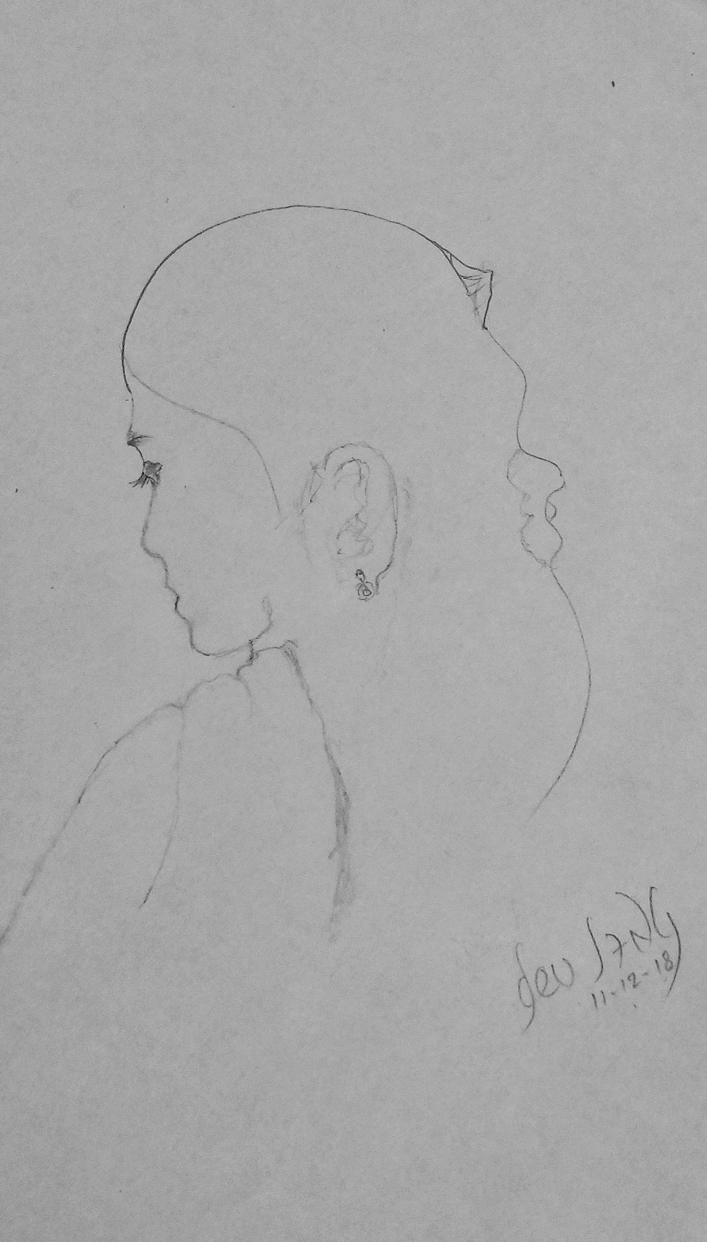
Use any diagram (or grid) as a starting interface-then let your reference photo correct it. The diagram’s job is to remind you which distances matter. The photo’s job is to tell you the values for that specific face and angle.
Common proportion mistakes
Most portrait proportion issues fall into a few buckets. If you can name your bucket, the fix is usually obvious.
Mistake 1: Placing eyes by “detail focus” instead of spacing
It’s tempting to start with eye texture, but likeness is more sensitive to eye spacing and eye level. Place the eye centers first, then iris highlights later.
Mistake 2: Nose length doesn’t match the reference
A nose that’s even slightly too long or too short tends to pull the rest of the face with it-especially the mouth alignment.
Mistake 3: Mouth corners don’t match the jaw width
If the jaw silhouette is narrower/wider than the photo, the mouth corners will look “attached” to the wrong geometry. Always check mouth width against eye-to-eye width and against the head silhouette.
Mistake 4: You fix one feature and ignore the rest
Portraits are systems. If you move one part for “likeness,” re-check the spacing relationships that interact with it.
Mistake 5: Camera angle and lens distortion ignored
Photos taken close up or from below/above can exaggerate features and change perceived proportions. Reduce this by measuring ratios from the same photo you’re drawing-don’t transplant “average” rules from a different angle.
Practice exercises
Practice works when it isolates one variable at a time. These exercises train proportion accuracy without turning every sketch into a full portrait marathon.
Exercise 1: The 5-line portrait skeleton
Draw only the structure lines first:
- Head silhouette
- Eye line (two points)
- Nose bridge reference
- Mouth line
- Jaw/chin contour
Stop there. Compare side-by-side with your photo. Only after it matches do you start shading.
Exercise 2: One ratio per sketch (repeat 10 times)
Pick one relationship and make it the “score”:
- Eye spacing ratio
- Nose length ratio
- Jaw width ratio
- Mouth corner spread ratio
Each sketch focuses on getting that one ratio right before moving on. Over time, your brain learns proportional placement faster than your hand can render detail.
Exercise 3: Photo flip check
Flip the reference horizontally (or mentally flip your sketch) and compare. Proportion mistakes often show up instantly when symmetry is reversed.
If you want a broader starting point for building portrait skills from reference, see Pencil Portraits drawn from photos and the drawing-focused learning index at /blog/.
Conclusion
Proportions are the backbone of pencil portraits: when they’re correct, detail becomes easier; when they’re off, the portrait fights you. Use the pencil pointer, a grid, ratio checks, and silhouette-first sketching to keep your structure aligned to your actual photo.
Key takeaways:
- Measure relationships first (spacing, alignment, ratios), then add features.
- Avoid “detail-first” eye placement-center and spacing come before texture.
- Check one-to-many interactions: moving a feature means re-checking neighboring distances.
- Practice with isolation: skeleton lines, single-ratio sketches, and flip checks.
If you’d like to turn this into a repeatable habit, build a simple workflow: (1) quick skeleton, (2) grid/ratio check, (3) features placement, (4) shading pass. That workflow is how “good portraits” become consistent portraits.